
I f you want to get inspired by the best newsletter signup examples, you've come to the right place.
Many people will simply include a sidebar newsletter signup form when starting a new blog. And that’s great; you’ve got to start somewhere.
But suppose you want to level up your newsletter form game and dramatically increase your email subscriber numbers. In that case, you’ve got to use the advanced techniques available through copywriting and digital marketing strategies.
So, if you’re ready to become a newsletter sign up wizard, here are some compelling email newsletter signup examples that are proven to work well. Look at them, see why they work, and get some ideas of how to customize them for your blog.
Key Takeaways From Effective Newsletter Signup Form Examples To Inspire
In This Guide:
- 1. Lightbox Popup + Coupon increased email signups by 16-51% for a restaurant
- 2. Text-Only Popup + Lead Magnet helped capture 65%+ of book buyers’ emails for an author
- 3. Simple Popup + Picture of You increased conversions by 6%
- 4. Floating Bar + Free Trial generated 800 new signups per month using social proof and curiosity
- 5. Yes/No Forms converted 60% of visitors by leveraging the Zeigarnik effect
- 6. Sidebar Forms remain a simple yet effective way to turn pages into lead generators
- 7. Sidebar Form + Fullscreen Popup boosted signups by 18%
- 8. Inline Forms converted 2-6% of engaged blog readers and over 50% on landing pages
- 9. Content Lock increased signups by nearly 11,000 by gating part of a popular blog post
- 10. Exit-Intent Popup + Content Upgrade saw 520% more conversions
- 11. Exit-Intent Popup + Related Posts + Inline Signup kept readers on site
- 12. Mobile Popup + Coupon helped increase daily email optins by 2.5x for an eCommerce store
Why Your Newsletter Signup Form Is So Important For Growing Your Email List
Getting lots of website visitors and traffic is only the first step in your blogging journey. Building an email list allows you to build a successful blog that’ll make money for years to come.
If you’re using a generic email signup form, you’re missing out on many potential subscribers. That means missing out on future opportunities for promotion, revenue, feedback, and engagement.
Want to know how to take your newsletter subscription form to the next level?
We’ve gathered some examples of high-converting email newsletter signup forms that are proven to convert readers into subscribers.
Each is persuasive in its own way. You can even combine them to multiply their power but beware. Your email newsletter list may grow dramatically quickly if you do that (just kidding, who wouldn’t want that?).
And the best part is that you can use the best conversion tool and lead form builder, OptinMonster to access 700+ templates with beautiful signup form designs, lightbox popups, countdown timers, and all of the latest best practices to entice your audience to join your email list!
- Drag and drop optin builder
- Multiple campaign types for actionable email marketing
- Powerful Exit-Intent® technology
- Seamless integrations with popular services
- Detailed insights to improve your campaigns
But I know what you came for. For the inspiring newsletter signup examples – so here we go!
12 Subscriber Email Newsletter Signup Examples and Why They Work
These work. And we have the data to show proof!
1. Lightbox Popup + Coupon
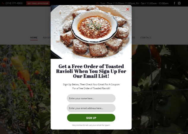
Guido’s, an authentic Spanish and Italian restaurant located in the heart of St. Louis, MO, added over 1,000 leads to their email list in just under four months.
This newsletter signup popup form uses a coupon (discount code) to help convert anywhere from 16% to 51% of site visitors, depending on the page it appears on. And by sending out an email newsletter, they can easily fill their restaurant.
2. Text-Only Popup + Lead Magnet
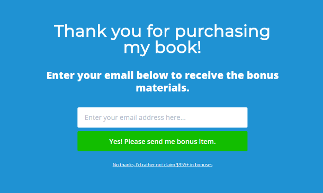
Danny Rusteen from OptimizeMyAirbnb.com uses a fullscreen welcome mat signup form to gather addresses from over 65% of the people who’ve bought his book.
Customers who purchase the book elsewhere can download bonuses and sign up for his newsletter by accessing the bonus link included inside the book.
This is a smart idea because it allows Rusteen to capture the email addresses of people he normally would miss out on because they bought the book from a third-party seller. Plus, it helps him segment his list more easily because he knows they’re already interested in his products.
3. Simple Popup + Picture of You
Another way to increase conversions of your email newsletter sign up form is to include images. More specifically, a picture of you or the people behind the blog.
People want to know who’s behind the blog they’re reading since it builds trust and credibility. When you read a blog from a seemingly anonymous person or business, it’s hard to trust the information, right?
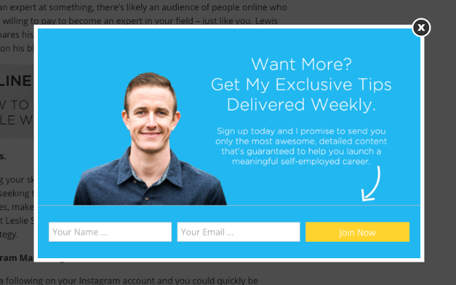
Writer, author, and entrepreneur Ryan Robinson enjoyed a 6% increase in conversions when he created this popup form on his popular blog.
He combined his picture with copy that explains the value of subscribing to his newsletter and made the email capture form easy to use.
4. Floating Bar + Free Trial
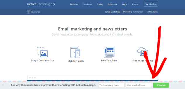
A floating bar email newsletter signup form is a simple yet effective way to increase your newsletter list. With this powerful form, ActiveCampaign generated an extra 800 new signups every 30 days.
Because it’s so small, you’ve got to be strategic with your calls-to-action (CTA) and copy.
In ActiveCampaign’s form, they use smart techniques like:
- Social proof from social media (“thousands have improved”)
- Curiosity (they don’t reveal the secret to the improvement)
- Anticipation (they promise email subscribers they’ll learn something if they provide their contact information.)
5. Yes/No Forms
A multi-step email opt-in form like a yes/no question uses the psychological principle, the Zeigarnik Effect, to increase conversions of potential customers. This effect states people who begin an action are more likely to complete it. It can lead to an increase in conversion of up to 18%.
In the case of the yes/no question, they are more likely to subscribe to your newsletter because they feel like they have a choice to do so (or not.)
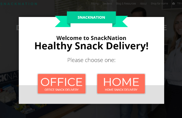
SnackNation, a subscription service for healthy snacks, uses a variation of the yes/no question to immediately segment their email subscribers between office and home users.
This popup immediately converts 60.4% of visitors who click the Home button, redirecting them to their subscription service.
They use a combination of the yes/no question CTA buttons and exit-intent popup to convert another 3.53% of abandoning visitors, which they’d otherwise lose.
6. Sidebar Email Signup Form
These are the workhorse signup forms that you’re probably familiar with. You’ll find them on most blogs, mainly because they just work. They’re not sexy or flashy, but they get the job done.
Here’s the one on RafflePress:
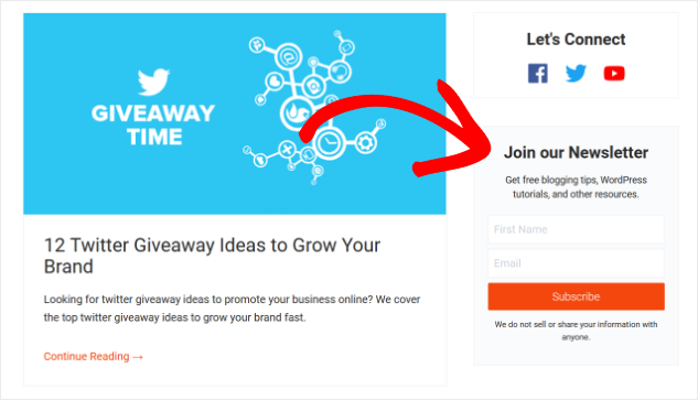
By themselves, sidebar newsletter signup forms don’t convert a ton of readers, usually less than 1% of people who see them.
But sidebar forms still have their place. They’re not as intrusive as a popup, they don’t distract your readers like an inline or slide-in form, and they turn every page of your blog into a lead generating opportunity.
7. Sidebar Form + Fullscreen Popup
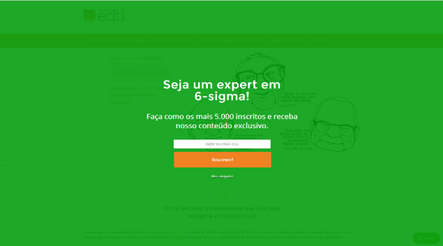
When you combine your sidebar form with another signup form on your site, however, that’s when you’ll start to see the most gains. Escola EDTI used a combination of a sidebar and fullscreen popup to increase conversions 18% and gather over 2500 signups in a single month.
8. Inline Forms
James Pollard from The Advisor Coach uses inline forms to convert 2-6% of his blog readers and by 360% site-wide.
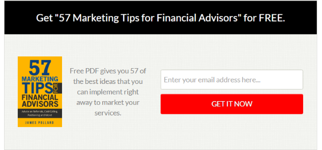
He uses another one on newsletter signup pages to convert over 53% of his readers, adding even more people to his email newsletter list.
Inline or embedded forms help you get the attention of your most engaged readers right when they’ve committed to reading your content.
That’s why they’re so effective for subscriber growth, especially on content-heavy sites like blogs. Plus, they’re non-intrusive and don’t disrupt people’s flow while they read and navigate your site.
9. Content Lock
The content lock available in some signup form software like OptinMonster is a way for blog owners to attract more subscribers by gating part of your high-value content.
You already give away most of your content for free, but you can make some of it more exclusive and valuable by putting it behind a “gate” or content lock.
It’s the text-based version of the free trial: readers get the first part for free but need to “pay” with their email address to finish the post.
Casey Stubbs of Trading Strategy Guide used the content lock site-wide to add nearly 11,000 subscribers to his mailing list in just over a month.
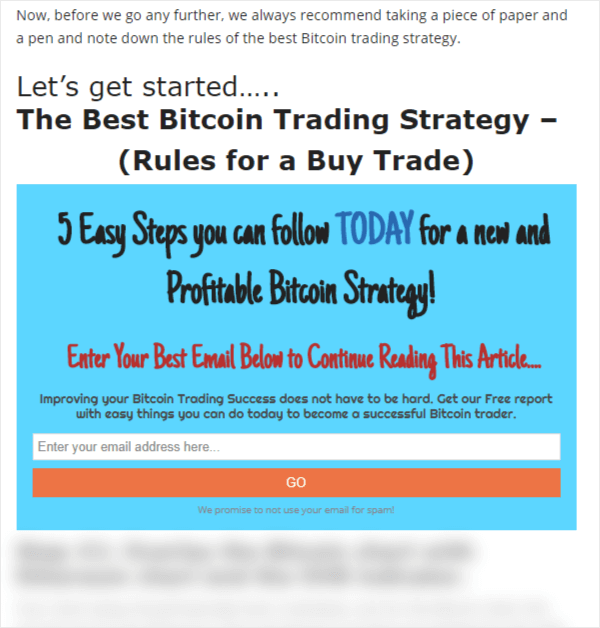
Stubbs used the content lock on a popup form for one of his most popular blog posts on Bitcoin trading because he didn’t have the time to create an entirely new lead magnet for this audience.
So he added the content lock to a post he already had on his blog, and in under two months, he added nearly 7,500 email subscribers to his list, which converted 17% of the readers to that particular post.
Not only did Stubbs gain thousands of new subscribers, but he was also able to segment his list automatically by tagging these signups specifically. Now, when he looks at his list, he can see precisely who’s interested in bitcoin and can send targeted emails to them.
10. Exit-Intent Popup + Content Upgrade Incentive
This type of popup is controlled by behavioral technology in your lead generation or email newsletter software (OptinMonster). It tracks and monitors visitors’ movements on your site and detects when they’ll leave without signing up for your newsletter.
Most eCommerce sites use it to remind you of any items you might’ve been interested in or put in your shopping cart but didn’t purchase.
Blogs can use it to maximize your content marketing and lead generation efforts. Those who do often see a 200-600% increase in newsletter signups when they combine it with other content marketing tactics.
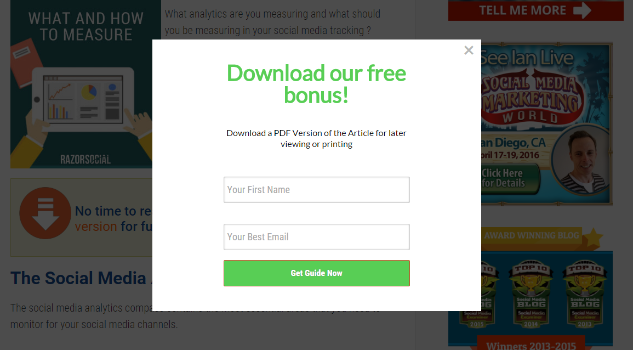
RazorSocial increased their conversions by 520% by offering a content upgrade incentive to the post people were reading.
11. Exit-Intent Popup + Related Posts + Inline Email Signup Form
Keep readers on your site for longer by showing an exit-intent popup to suggest other posts related to the one they were just reading. Then, be sure to include an inline signup form somewhere on those posts to increase the chances they sign up.

12. Mobile Popup + Coupon
AutoAnything, an ecommerce business and leading online retailer of aftermarket automotive products, uses a mobile popup and coupon popup combination to encourage newsletter subscribers.
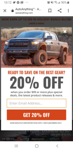
They used it, along with a combination of a few other signup forms on their site, to increase daily opt-ins by nearly 2.5 times and increased email revenue by more than 20%.
Great Newsletter Signup Form Examples In Closing
And that’s it! We hope you enjoyed this post on the best email newsletter signup forms that work.
Next, be sure to check out our list of easy hacks to grow your email newsletter. And if you’re not sure what types of emails to send your new subscribers, here are some fun newsletter ideas you can use.
Want more blogging guides like these? Make sure to subscribe to our email newsletter so you can get the expert advice you need to grow your blog.

Although the sidebar form seem generic and outdated, it is still effective on my websites.
Text-Only Popup + Lead Magnet this has to the best ever. Simple yet converting.
Good!
Very well written & done my friend!
I’ve just started writing myself just recently annd noticed lot of articles merely
rework old ideas but addd very little of benefit.
It’s fantastic to read a beneficial post of soke real value to me, as a reader.
It’s on the list of creteria I need to emulate as a new blogger.
Visitor engagement and content quality are king.
Some great suggestions; you have unquestionably made
it on my list of blogs to follow!
Carry on the fantastic work!
Well done,
Chickie