A re you looking for landing page optimization tips? If you want to get more conversions from your landing page, then you’re in the right place!
If you know how to monetize a blog, you’re probably looking for ways to get more email subscribers, generate leads, or even boost sales. And landing page optimization is how you’ll accomplish your goals!
A landing page is a standalone page on your website specifically designed to convert visitors into leads.
But what if your landing page isn’t working?
In this article, we’ll share some easy landing page optimization tips and tools that will help you boost conversions.
Okay, let’s get started.
What is Landing Page Optimization?
Landing page optimization is the process of improving all of the different elements of your landing page in order to increase your conversions.
So, if your landing page is not converting, you can change specific elements on the page to increase the conversion rate.
Even the smallest of changes can result in a dramatic boost in conversions!
But how do you optimize your landing page? How do you know which elements to add or improve?
Next, we’ll share landing page optimization best practices so that you know exactly how to optimize your landing page.
20 Landing Page Optimization Tips and Tools
1. Make Your Landing Page Offer Clear
Successful landing pages offer something valuable to the visitor in exchange for the action you want them to take.
That could be:
- Signing up for your email newsletter,
- Registering for your webinar,
- Or buying a product.
Visitors are more likely to convert because they’re getting something in return.
So, you need to make sure your offer is clear.
The easiest way to do this is with your landing page headline.
Take a look at this example from Taboola:
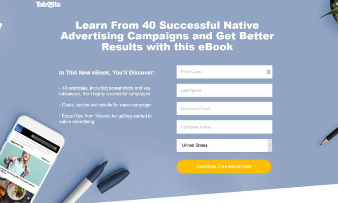
The headline stands out at the top of the page and clearly tells readers what the offer is—an eBook that will teach them how to get better results for their native advertising campaigns.
Because Taboola is a native advertising company, this headline also addresses the target customer’s goal. Visitors can tell by reading the landing page headline that Taboola can help them with their needs.
2. Use a Simple Landing Page Design
When designing your landing page, it’s best to keep it simple and to-the-point.
A cluttered landing page will only distract people from what you want them to do.
Here’s a great example of a simple landing page design:
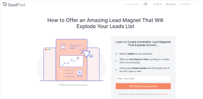
The example above uses a white background, a simple image, and briefly tells visitors about the offer and how to get it. There’s nothing else on the page to distract users from downloading the lead magnet.
If you’re not a designer, don’t worry. You can use SeedProd, the best landing page builder for WordPress, to create simple yet beautiful landing pages.
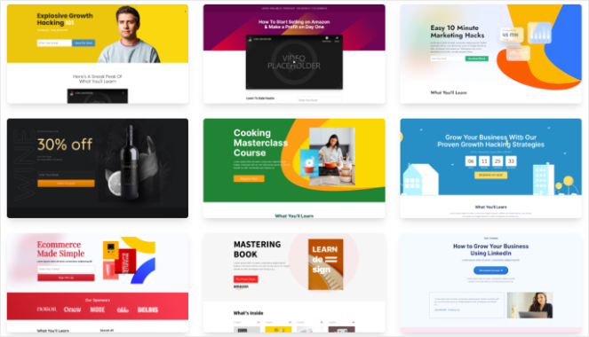
SeedProd offers a library of landing page templates to ensure your landing page is well-designed.
3. Use Contrasting Colors
Another good landing page optimization tip is to use contrasting colors in your design.
Contrasting colors help grab visitors’ attention and highlight important elements on your landing page.
For example, Netflix’s landing page uses a dark, nearly black, background. The headline is in white and the call-to-action (CTA) button is red.
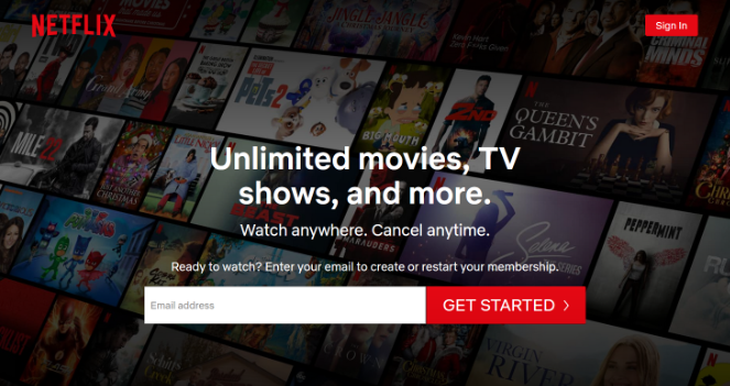
This draws your attention right away to the headline, which explains the benefits, and the CTA button where you can get started with Netflix.
4. Keep Important Info Above the Fold
The concept of above the fold goes back to traditional newspapers that were printed on large sheets of paper. When they were ready to hit the newsstand, they were folded in half, which led to only the top half being visible to people passing by.
Above the fold is the same for digital content. Anything that is immediately visible on the page to users is above the fold. Anything that isn’t visible immediately, requiring users to scroll down the page, is below the fold.
Remember to always keep the most important information above the fold.
You want visitors to immediately see the most important part of your landing page, which is typically the information about your offer and your call-to-action.
5. Make Your Call-to-Action (CTA) Clear
Your CTA is one of the most important elements of your landing page because it tells visitors what to do next.
So, you want to make sure your CTAs are clear and obvious on the page. If they’re not, visitors will be confused and leave your landing page without converting.
First, make sure your CTA is above the fold, like we discussed in the previous tip.
And second, make sure the text on your CTA is clear and concise.
Popular CTA phrases that work well are:
- Get Started Now
- Yes, I Want This Deal
- Download Now
- Reserve Your Spot Today
Here’s a great example from blogger and entrepreneur, Lilach Bullock:
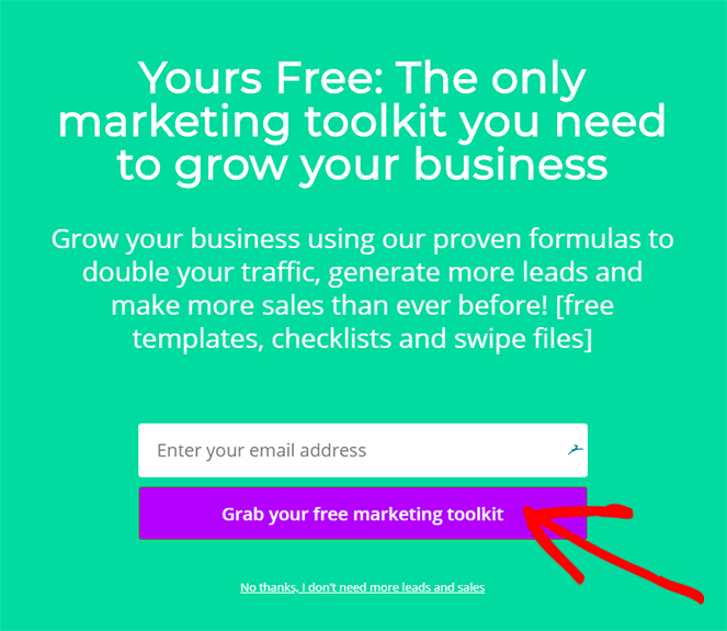
“Grab your free marketing toolkit” tells visitors exactly what they’re going to get when they click.
6. Repeat Your CTA on Long Pages
If you create a long-form landing page, it’s best to repeat your CTA a few times throughout the page.
You don’t want visitors to scroll down to the bottom of the page and not have a CTA to click on. And many visitors won’t make the effort to scroll back up to the top to find your CTA button.
But, if you place a CTA at the top of the page, in the middle of the page, and at the end, visitors will always have an easy way to convert.
7. Write Great Landing Page Copy
Some people will only skim the copy of your landing page…but many others will read it.
So, you need to make sure your landing page copy convinces visitors to take action.
For instance, if you have an online store and you create a landing page to highlight a specific product, don’t just write about the features of that product. Instead, focus on the benefits that people will get from using your product. This is much more persuasive to shoppers than listing the features.
8. Use Different Types of Media
To make your landing page more engaging, you need to add media to it. But don’t just use static images.
Try using different types of media like videos or animated GIFs!
Videos are especially helpful in boosting conversions. Here are some powerful video marketing stats to prove it:
- 83% of video marketers say video helps them with lead generation.
- 66% of consumers prefer watching a video to reading about a product.
- 84% of people say they’ve been convinced to buy a product or service by watching a brand’s video.
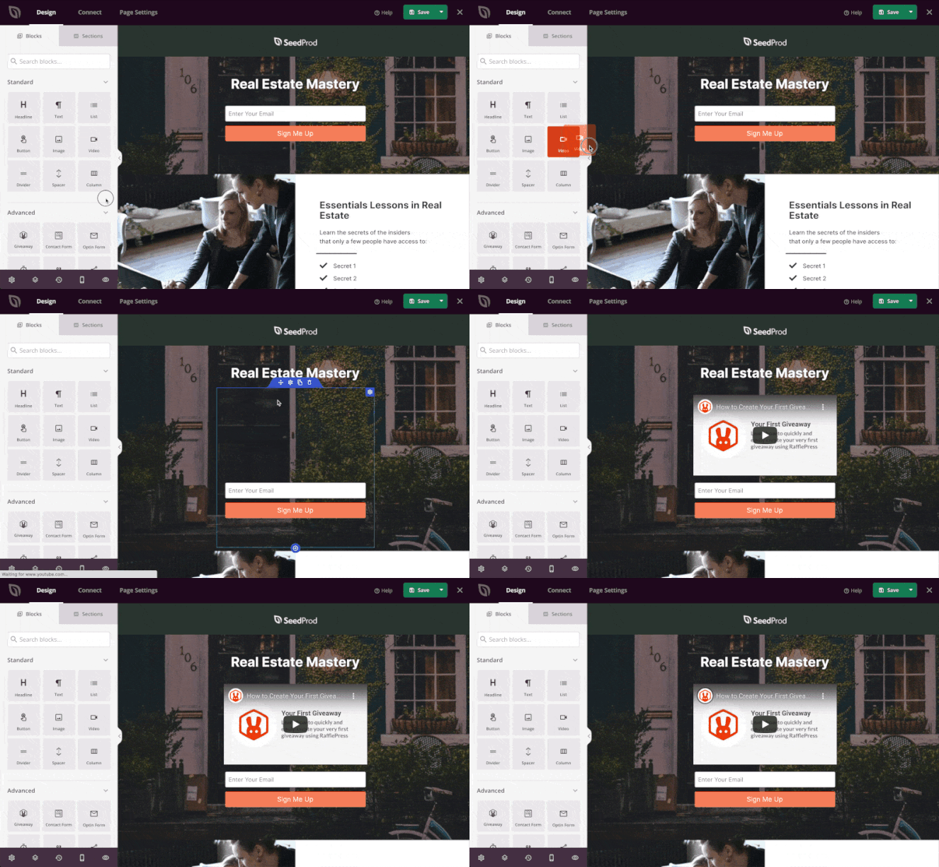
You can easily add a video to your landing page using SeedProd. Simply drag the video landing page block onto the template and in the settings, paste the video URL.
9. Try Limited-Time Offers
Another clever landing page strategy is to use limited-time offers. Limited-time offers make people act fast to avoid missing out on a good deal. This tactic is often called creating a sense of urgency and it’s a great way to skyrocket your conversions.
In this landing page optimization example, the coupon is available for a limited time only and a countdown timer is added to increase the sense of urgency even more.
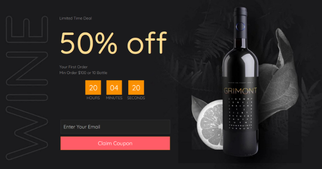
Visitors will rush to claim the special offer before time runs out.
10. Be Consistent
If you want your landing page strategy to work, you also need to be consistent.
For example, here’s a Facebook ad from Xero:
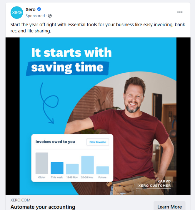
If you’re interested in Xero’s online accounting software, and you click on the Learn More button, you’re taken to a landing page that looks like this:
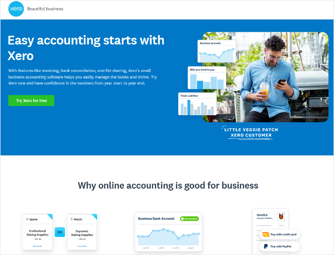
Notice how both the Facebook ad and the landing page have similar messaging and a similar look visually.
With consistent messaging and visuals, visitors won’t be confused or upset when they land on your landing page.
Plus, consistent branding will make your business more memorable and trustworthy, which can help you boost conversions.
11. Optimize for SEO
If you want to drive more traffic to your landing page, then you need to optimize for SEO.
When you optimize your landing page for SEO, it’s more likely to show up near the top of Google search results, resulting in more users being able to find your site.
You might be wondering, how do I optimize my landing page for SEO?
Well, you can do things like:
- Add industry-related keywords to your page
- Get backlinks to your landing page
- Make sure your landing page is mobile-friendly
We also recommend using AIOSEO, it’s the best WordPress SEO plugin on the market and it’s a great landing page optimization tool.
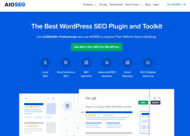
AIOSEO will help you optimize every page and post of your website for higher search rankings. The TruSEO Score will tell you how well your page is optimized and give you an actionable checklist of improvements you can make to unlock maximum traffic.
If you’re new to SEO, check out our guide on blog SEO for more tips.
12. Display Social Proof to Build Trust
This landing page optimization tip is all about using social proof to build trust and increase conversions.
Social proof is a phenomenon where people look to the actions of others to decide what they’re going to do in a situation. For instance, if you notice that a lot of people are watching a new movie, that encourages you to watch it too; if a lot of people are watching it and enjoying it, it must be good!
You can use the same tactic on your landing page.
Testimonials are a great way to display social proof on your landing page. When visitors see that other people are happy with your business, it will convince them to become customers too.

Don’t have any testimonials yet? Check out our guide on how to get testimonials.
13. Add Social Share Buttons
If you want your visitors to be able to share your landing page with their family and friends, increasing the chances of your page going viral, then you should add social share buttons to your landing page.
With social share buttons, your visitors can share your page with tons of people on social media in just 1 click.
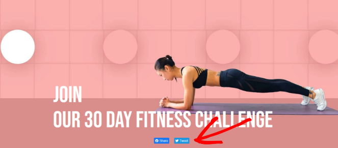
This is a great way to increase word-of-mouth marketing and generate more traffic to your landing page. With more people checking you out, you can generate more leads and conversions.
14. Add Your Contact Information
For people who are hesitant to buy from your business and want to ask a few questions first, be sure to add your contact information to your landing page or at least add a prominent link to your contact us page.
Displaying your phone number and email address on your page lets people know that they can easily contact you if they have any questions. This removes a major obstacle in the buying process.
Aside from adding your contact information, you can also add a simple contact form or a live chat service.
15. Test Out Different Form Lengths
Most of the time, we recommend keeping the optin forms on your landing page short; only ask visitors to give you the necessary information, like their name and email address.
The shorter your form is, the more people will complete it.
But, some businesses need longer forms.
For example, a B2B business like a graphic design company may create a landing page to book new clients. They would likely need more information than just a name and email address. In this case, the company would need a longer form to get information like the project details and budget.
Experiment with different form lengths on your landing page and see what works for your needs.
16. Use a 2-Step Optin
On a typical landing page, people can sign up for your offer in 1 of the following ways.
By:
- Clicking the CTA button
- Filling out a form
Using a CTA button is the better method if you want to get more conversions because some visitors can be scared off if they see a form to fill out right away.
But, when visitors click a CTA button, it redirects them to a different page, which can negatively affect the user experience.
Instead, you can use MonsterLinks from OptinMonster to create a 2-step optin form. This lets you display an optin campaign whenever someone clicks on the CTA button and the form will display on the same page, rather than redirecting users.
Here’s an example of it in action:
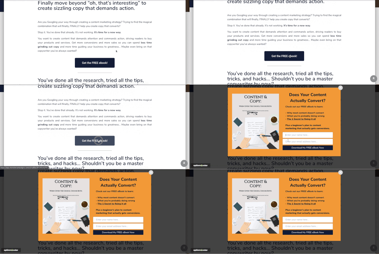
Visitors that click on the CTA will be more likely to complete the process because they already showed interest by clicking it in the first place.
Plus, there’s a psychological phenomenon called the Zeigarnik effect, which states that users are more likely to finish a process once they’ve started.
So, a 2-step optin is a powerful way to boost conversions.
17. Use Exit Popups to Recover Abandoning Visitors
Many people will visit your landing page and leave without converting. And you may never be able to get those people to return to your site. That means you’re missing out on a ton of conversions.
Luckily, there is a way to recover abandoning visitors on your landing page!
With exit popups, you can track when a user is about to leave your site, and show them a targeted message at just the right time. This offers you an extra opportunity to convert them.
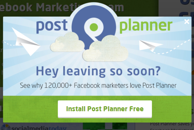
Using OptinMonster, you can easily build eye-catching, effective exit popups to turn abandoned visitors into customers. OptinMonster has a user-friendly drag and drop builder and it comes with a ton of different campaign types and triggers.
18. Decrease Your Page Load Time
When optimizing your landing page strategy, don’t forget about your page load time.
If your landing page loads too slowly, visitors will get frustrated and leave. This will lead to an increased bounce rate and a loss in conversions.
To decrease your page load time, you can do things like:
- Use fast and reliable hosting services
- Compress and optimize your images
- Use a caching plugin like WP Rocket
- Keep your website updated
For more tips, check out this post on how to speed up your WordPress site.
19. Monitor Your Landing Page Analytics
So, how do you know if your landing page is effective?
To find out how well your landing page is working, you need to monitor your landing page analytics.
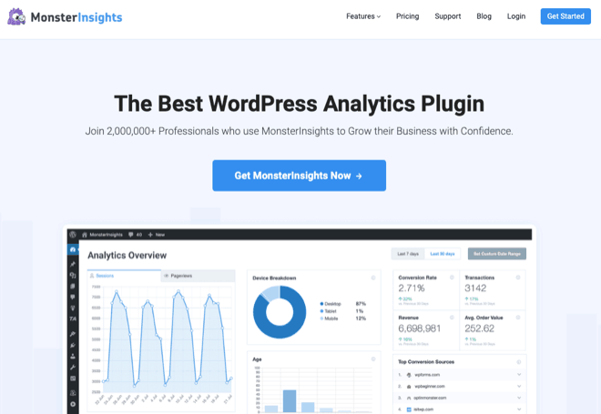
Using a tool like MonsterInsights, you can easily track your landing page conversions right from your WordPress dashboard.
With MonsterInsights, you can discover your most popular pages, track file downloads, understand where your traffic is coming from, track form conversions, and much more.
Using these actionable insights, you can make changes to your landing pages to improve conversions.
For example, you can find out which of your landing pages converts the most subscribers or customers. Then, you can optimize your other landing pages to achieve the same results.
20. A/B Test Your Landing Page Elements
Finally, A/B testing is a landing page optimization best practice that you can’t ignore.
A/B testing is a method of comparing 2 different versions of a webpage against each other to determine which one works better.
You should be A/B testing each element of your landing page in order to create the highest converting version possible.
For example, you can carry out an A/B test to determine which CTA button phrase converts better.

Just remember to do A/B testing for 1 element, like the CTA button text, at a time. If you test too many elements at once, you won’t be able to tell which change is making the biggest impact on conversions.
That’s a wrap!
Now you know a ton of ways to optimize your landing page for more conversions.
You can use this guide as a landing page optimization checklist and get started right away! After making just a few small tweaks, you should be able to see your conversions rise in no time.
If you enjoyed this article, then check out the best landing page examples and how to create your own.
And don’t forget to sign up to our email newsletter so you can get useful content like this sent right to your inbox!

0 Comments
Join in. The comments are closed after 30 days.