Your menu is still one of the primary ways that traffic navigates around your site. Deciding what to put in it, however, may be a little more complicated than first thought.
In the old days, a website would have four main links: About, Blog, Contact, and a Home button. But as technology improves and changes, it’s now possible to do a lot more with the humble menu.
Today I’m going to show you a few things I’ve been testing in my own menus as well as some interesting examples from around the web. Hopefully they help you build a menu that’s a little bit more effective.
What is the real purpose of a menu?
It might seem obvious to some, but when I really sat down to think about what I needed in my menu I found that the question was a little bit more difficult than anticipated.
For example, all of the posts that I write are filled with in-post links that send people off to relevant articles that will (hopefully) help them as they’re related to search terms they are reading about.
So, if all of the important links are there in any given post, what do I need the menu for?
This got me thinking that maybe it was less about getting people to move around the site, and more about sending them in a specific direction that helped them achieve certain outcomes based on my blog’s goals.
And that leads us to the next point.
Coming up with some goals for your menu
Before you decide what to add to your menu it’s really important to come up with some goals.
And the goals you have for your menu will closely align with the goals you have for your blog and your blogging strategy as a whole.
If you don’t know what you’re trying to achieve on your site as a whole, there is no way your menu will be effective.
So what outcomes are we looking for in the menu?
- Getting people to make contact
If you’re a physical business like a physiotherapist or a mechanic, then one of your menu’s primary functions will be to make it easy for people to ring and make an appointment. We’ll look at ways to do this below. - Encouraging sign ups
A blog will likely be focusing on mailing list sign ups and, as such, some of your menu real estate should be devoted to making it easy for people to subscribe. - Making people aware of announcements
If you’ve just spent months developing a new tool or creating a conference then you want to make sure that is present in a menu, especially if you’ve been advertising it around the web. - Clarifying their place on site
If you have an ultra-complicated website (think Amazon.com) then the menu should be devoted in parts to helping people understand where they are so that they don’t abandon. This might also work for a checkout process or some sort of timeline. - Making a direct or indirect sale
Making a sale will be a primary purpose of many menus and can be done by either directly promoting a product, or leading people to a landing page or additional content that will make the pitch.
When we decide on a goal for the menu based on our blog’s overall strategy, it will be much easier to create something that makes sense and converts well.
What do other sites put in their menus?
What I’d like to do now is show you a few examples of all of these different goals in action in the hope that it gives you some ideas for how to structure your own menu effectively.
1. Making quick contact
The first example comes from friends of mine over at Reliable PSD who have a stunning menu that has a big emphasis on getting a free quote for your project.
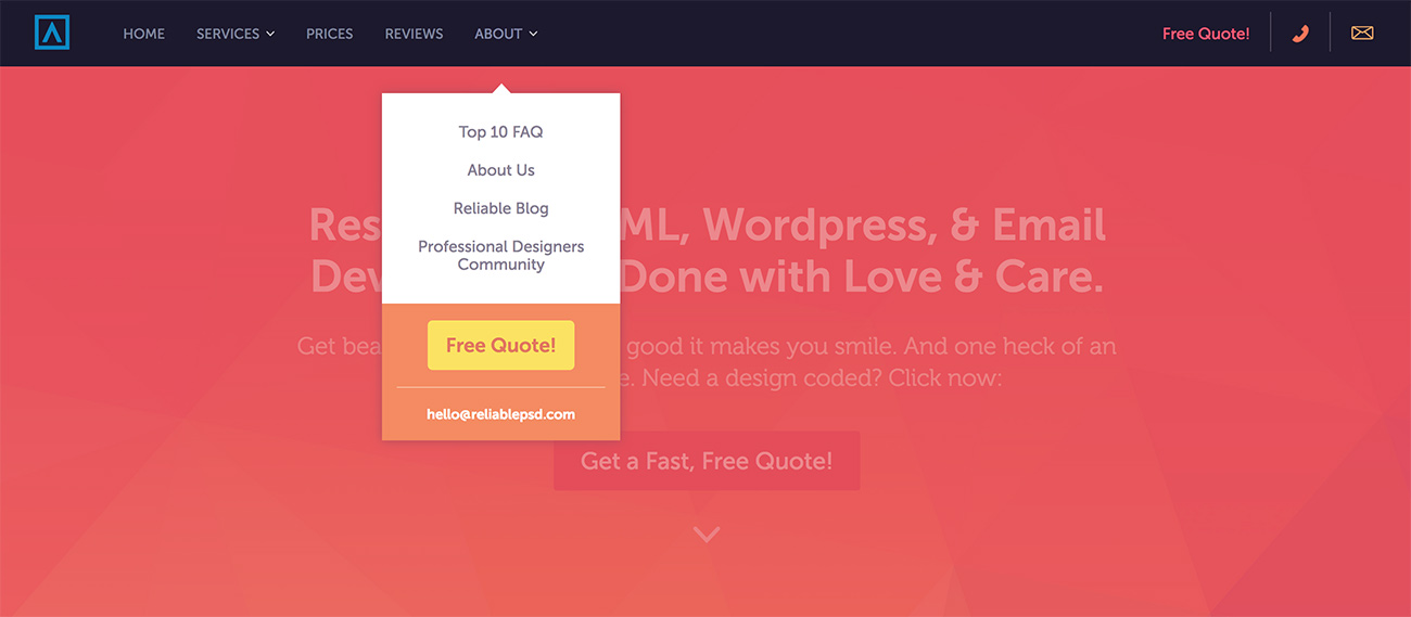
The “free quote” option appears three times in the menu, and is accompanied by an email address in case people want to make contact directly without going through the quote form itself. This is a really clever thing to do in a business where people want quotes and prices quickly.
2. Encouraging quick sign ups
A service like Slack is so simple and elegant that one of their best sales tactics is just to get people to try it out without wasting too much time.
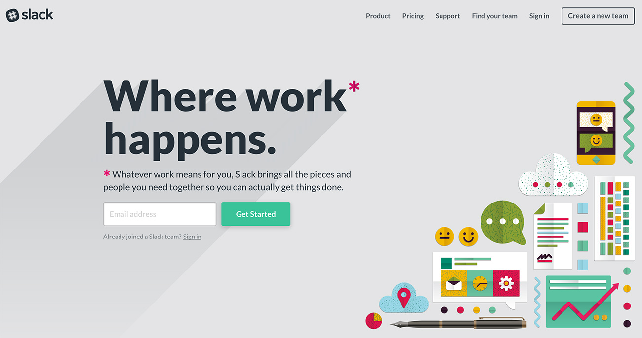
As you can see, their menu is simple and has a big emphasis on one goal – creating a new team. Essentially they’re asking people to try it out and get their friends or colleagues to do it as well.
From that link, you just enter your email and you’re pretty much ready to go. It’s a brilliant way to quickly get people using the service before too many bounces can occur through multiple navigations or explanations.
3. Making announcements
One good example of a complicated website with a good menu is ASOS which, at present, has an announcement for a sale that is happening on the online store.
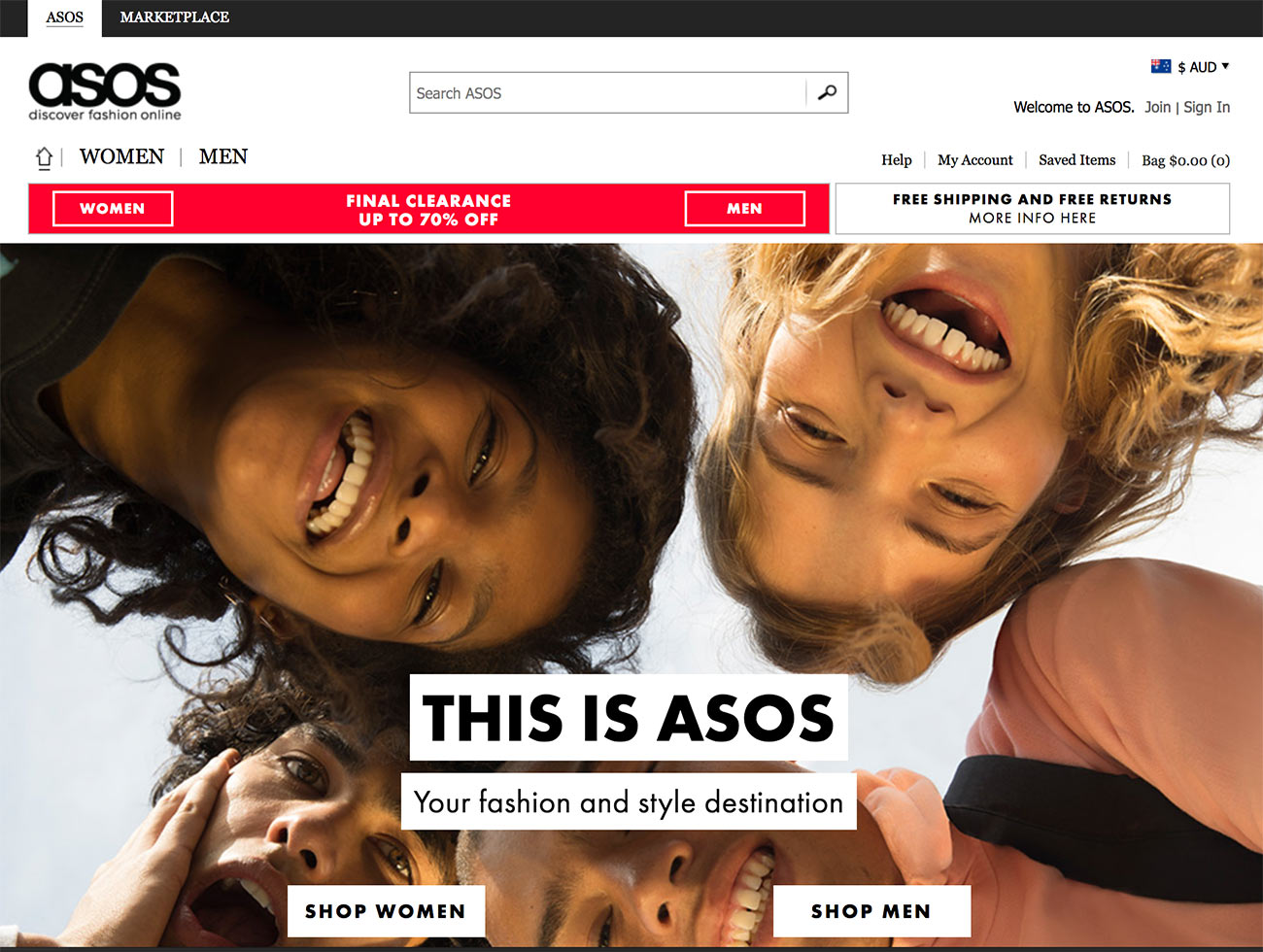
As you can see, the menu divides the store into Women and Men quite clearly, and uses a very distinctive color to show that a sale is on. It’s impossible to miss. This is a good idea to keep in mind for our own menus – sometimes you need a contrast of color to bring attention to something.
I’ve tried to do something similar in the top right corner of Blog Tyrant as the color changes when you scroll from the very top position.
Another really clever example of an announcement is over on Popular Mechanics right now.

They’ve transformed their whole header into a Solar Eclipse animation and added a big link below it which goes to a massive guide about this year’s eclipse.
Integrating a big piece of content with a current event is a really clever way to get back links and create a lot of buzz around your site.
4. Making quick sales
One of the best menus that I keep coming back to is Smart Passive Income by Pat Flynn who has an incredible moving graph of his earnings, as well as clever links to important products and content areas.

Pat was one of the first to test and pioneer the “New? Start here” link in the menu and it has been working really well for him. He also now has an extended selection of products that you can buy right there without any digging.
One thing that impresses me about this menu is how you can almost decipher Pat’s whole brand by just what appears in the top navigation area. Everything you need to know or do is in that one place.
Remember, there’s more than one menu
It’s good to remember that there are often more than one menu on any given blog or website and, thanks to mobile technology, there is often a separate menu for mobile devices.
This is important to think about because often you will find that the feature you want to add to your desktop main menu could be entirely different for something that people will do on mobiles.
For example, if you have some software or product that only works on a desktop computer then it is probably not ideal to devote a large menu promotion towards it. Instead, it might be better to promote your mailing list, build interest, and take a more long term approach to the sale.
Also, many of the examples that I looked at had sub-menu items, and even some hidden “Easter eggs” that can make the whole thing a little bit more exciting. You might decide that you need more than one menu at different places on a page, or on different pages.
How to make your menu better
Once you’ve figured out what you want to put in your menu, you might need a little bit of help to integrate some new features and really bring it to life.
If you’re on a self-hosted WordPress setup then there’s lots of things you can do with a menu, besides WordPress’s ability to create and edit menus for any theme that you use.
For example, a plugin like UberMenu will allow you to create massive mega menus with slide outs, integrated codes and maps, buttons, etc. which can be really handy if you have a plan for something different.
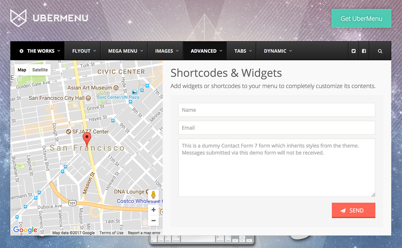
But if you don’t want to go that complicated route, you could always just simplify your navigation down to one specific goal and remove all the clutter. That is something that I’ve been testing on and off for a while and I really think it’s worked.
Whatever you end up doing, make sure you do test it for yourself to make sure that it is getting actual positive results instead of just a nice design and feeling.
Have you ever done anything different with your menu? I’d love to know about it in the comments below.

Interesting, Ramsay! When your email arrived in my mailbox, this is exactly what I was contemplating. Some months back I revamped the menu on my blog realizing that much of it was not as useful/relevant as it was earlier. I minimized it and the layout definitely looked better. Then a couple of months ago, I knocked off the sidebar, keeping only the essentials under the header. And today, I am thinking again to see how I can make it better. Off to read the in-links in the post!
I’ve been following your blog forever in internet years 😀
Nice to see you again, Vidya! I had a look and your first comment was back in 2011! That is incredible.
Like Vidya, I have also been contemplating what to do with my site. It needs a facelift and the menu section would be a good place to start. I’ve also simplified the look of my site by eliminating the side bars etc.
Now to check out the links in your article!
Hope it helps!
Ramsay, great article, an important point for serious bloggers to consider. I have 2 menus on my site, both serve different purposes, one on the top, one on the side.
Great point that the blogger should think carefully about those 4 or 5 key items in the main menu which he/she wants their readers to think about. I am in a process of refining these items. I am looking at yours Ramsay and they appear to be well-thought-through.
As ever, great insight, off to share and flip.
Really appreciate those shares. Thank you.
Brilliant article again and perfect timing (for me)!
I’m soon launching a new business and probably a new website!
It seems that we know (and appreciate) the same people!
The guys behind Reliable psd, David Tendrich and Lou Levit, are co-writers at Millo, one of the top blogs for creative freelancers and entrepreneurs!
This is the magic of internet, 3 different continents seem to be so close!
It’s funny how those things work sometimes. I’m glad you’re enjoying it!
Great post! Can I just say that I LOVE what you’ve done with the titles of your menu? It’s fresh and I want to click all the things. Well done. 😉
Thanks mate!
What a perfect time! Your e-mail just came up and it was new. I never heard it before that our blog menus are really important. Thanks Ramsay! This is so great.
Thanks Ellen. Glad you enjoyed it!
Hi Ramsay,
I’m always playing around with my menu. There’s always a temptation to put too many menu items.
But I guess as research always shows ‘simplicity is the best’.
I think 5 or 6 Menu items or less is best. You’ve gone 1 step further with just 4 lol.
The paradox of choice – the more choice we give our web visitors the more confused they will be.
P.S. I love Pat’s menu, it’s easy to navigate around and yours is simple and to the point.
I agree. I think four is too many! Ha.
Refresher course as usual Ramsay. I thought about that but I wasn’t sure what to do but now I have a good idea.
By the way can you tell us the reason that you do not use a sidebar on your blog?
Hey Ramsay,
Great post as usual.
Each of these featured sites seem to have crafted the menus based on what they’re trying to achieve. This trend is growing I think.
Instead of giving people every possible option, publishers have switched to minimalism, and are trying to control and ensure what their audience will see, exactly.
There are less bells and whistles in sidebars. I’m fine with this idea. After all, who knows what’s the best content on website for audience other than the publishers?
I see how you got rid of the search box on Blog Tyrant – I thought it was a mistake. But then I realized how it directs people from one page to another through the posts and content itself.
The appearance of Medium and other similar sites, too, feel quite appreciable.
I think we’re moving towards eliminating chaos for audience through website design as well. As a reader and part of general audience, I love this change.
I’ve got a post coming up about the search bar thing soon!
These are great ideas, Ramsay!
I would love to figure out how to add a subscription form to my menu. I have a WP .com site. (BTW, they just added plugins!) When readers are on their phone, they don’t see the sidebar with the sign up until they hit the bottom of ten posts.
I would recommend adding a landing page to your menu specifically showing the benefits of your mailing list. That solves both problems.
Great Article Ramsay.. Thank you for providing us with so many of useful resources.
No worries!
Actionable items in my menu. My usual response when reading your blogs is ‘gah, that’s helpful’ and then I look up and you have your actionable click through in your menu too – boom instant win – thank you!
I’ve been focusing so much offsite – that I had not considered my menu as a place to earn ‘helpful clicks’… Another perfectly timed blog.
For me – Outside of navigation, robots, robots and always thinking about how the robot is looking at my page – The menu seemed to always suffice as being very straight forward… now after reading your content and others – I feel my ‘content’ needs a landing page – just wasn’t sure where it fit in the pyramid.
The idea of building that ASOS.com style menu seems – extremely effective now with a growing ‘category/blog’ – and I’ve been sort of wondering how to present that without the usual – boom here’s the blog. So, I do appreciate that link.
Thanks again Blogtyrant. Another extremely potent piece of content to send to all of my friends and clients – Keep this up, dude. I very much appreciate the success you’ve helped me generate!
Some how when I find myself wondering where my bouncing is going, and constantly second guessing myself, you sort of CHIME IN.
If anyone is wondering if they should subscribe – just do it!
Thanks !
TylerG
That is such a kind comment, Tyler. Thank you very much.
Hi Ramsay,
Great post as ever!
Like you I fill my blog posts with in-post links that send people off to relevant articles. Does that make the search button redundant? I don’t think so. Does that render the menu section useless? Maybe. I think the jury us definitely out on that one 🙂
But seriously, although I only started my current blog in June, I have played around with the menu section, the categories section and the side bar a few times. My goal is a blog that screams quality, with a menu section that’s as irresistible as puppies. I hope I have been able to achieve that from both the layout of my blog and the way the menu section is organized.
Thank you for opening up this conversation, which needs to be had.
Best regards,
Pedro
I’m not a fan of the search function for my blog. I have a post coming up about this soon.
Fantastic educational content, as always, Ramsay. I love your idea of having the goal of your menu align with the goal for your blog, rather than just acting as a simple navigation tool.
Thanks Melanie!
Hey Ramsay,
In the beginning of the post, you mentioned that you would talk about some of the tests you’ve done with your menu. Yet there’s only one short mention of something you did. Did you forget this part? Or was that it?
I tried a drop-down menu about a decade ago on one of my sites. (I guess they’re now called “mega menus.”) Several people were annoyed by it, so I switched back to something similar to what you have. I don’t really understand why people love them now. Personally I find them annoying (because of the extra step to click). I also find some of them confusing.
Pat Flynn’s website is interesting in that his current design was in response to people having a hard time finding things on the old site. Well I would argue that his current design (although beautiful) makes it a lot harder to find things. For example, it took me a few days after it was launched to find where the old podcasts were. And awhile back, I had to resort to a Google search to find an old post because his search feature is (or was) so bad.
Hey Matt.
Honestly, I totally forgot to add that section at the end. I knew it felt like it ended abruptly. I’m going to do that now! Thanks.
I wonder if the issue with Pat’s is less about the menu and more about him emphasizing new content? Could be a design thing as opposed to function?
Hi bro
Suggest me which theme is more effective for news website
Thank You
Have a look at themes like Unicon or Genesis.
Bro free theme
Detailed Post as usual.
Navigation menus are very important part of any website or blog. It helps the audience to easily access the blog with ease.
Thanks.
Thanks for this post, Ramsay.
It’s great and straight to the point. You did not only mentioned it, but you set the example which is very nice of you.
I am looking at your menu right now, and it’s singing a song, titled ‘improvement!’
When it comes to menu arrangement, I’ve always believed that ‘less is much better’, for, it works for me too.
I’ve noticed that it’s very easy for webmasters to overlook the ‘value’ of proper menu arrangement.
But no matter what we do; in the end, simplicity will always win.
Thanks for the great comment!
Hi Ramsay,
I’ve actually played around with my menus several times and my blog isn’t even a year old.
When I first started, I think I had 13 items on a top and bottom menu.
Now I only have a bottom menu. I still think I have too many links and options for people.
I love how you’ve gotten yours down to only 4 items.
Maybe one day, I’ll realize what I actually want mine to look like? Who knows, I am constantly tweaking this and that on my blog.
Have a great day 🙂
Susan
Hello Ramsay,
Navigation menus are really helpful these days, every blogs are now trending to have these.
The steps you mentioned here are would do a great help to customize our website menus.
Thanks for the share.
Shantanu.
I thought I was the only one who considered the menu to be more complicated than people let on, until this post arrived in my inbox! Thank you so much for your insights.
Ramsey,
I have a free WordPress theme. How do I make a navigation tab on my website for my blog? The address http://www.MyWordOnTheWord.com goes to my blog.
http://www.MyWordOnTheWord.com/home/ goes to my Welcome! page. But on the Welcome! page, and the other pages, there’s no navigation tab for the blog. Yes, there are Recent Posts in the sidebar. But I’d like to have a tab for My Word.
Is this doable for a total non-tekkie?
Thanks for the tips, Ramsay. I recently moved, in both my virtual and physical world, so I haven’t had time to play around with my menu much since switching to Squarespace. But I was thrilled to see this email because I need to make some changes. And I need to figure out what the heck my goals are! I’m in a transition phase, so it looks like I’ll have to sort that out first. Thanks again for the helpful information. I always make a mental note of these posts and return for further study.