
A re you looking for ways to increase conversions on your blog? Welcome! You're in the right place!
Generating traffic is just the first step. If you can’t convert that traffic, then that traffic means nothing. As a blogger, it’s your job to analyze why visitors aren’t converting and remove any barriers to conversions.
Below, we’ll go through some quick and easy ways to boost conversion rate optimization (CRO) on your blog, whether you want to increase subscribers or sales.
Let’s get started!
Great Ways To Increase Conversion Rate On Your Website
In This Guide:
- 1. Write Clear Headlines
- 2. Write Copy That Talks to Your Readers
- 3. Use Bullet Points
- 4. Stay Away From Jargon and Use Simple English
- 5. Add Videos
- 6. Add Relevant Images
- 7. Send Emails and Newsletters
- 8. Automate Your Email Marketing
- 9. Offer a Lead Magnet
- 10. Try Different Offers
- 11. Add a Popup To Your Site
- 12. Add Forms
- 13. Remove Unnecessary Form Fields
- 14. Offer Auto-Complete Fields
- 15. Make Your Search Bar Prominent
- 16. Include a FAQ Page
- 17. Optimize Your About Us Page
- 18. Create Visually Appealing Landing Pages
- 19. Add CTAs
- 20. Strengthen the Copy of Your CTA
- 21. Choose the Right Color For Your CTA
- 22. Optimize CTA Placement
- 23. Make The Initial Step Really Easy
- 24. Add Testimonials, Reviews, and Logos
- 25. Showcase User-Generated Content
- 26. Post on Social Media
- 27. Monitor Your Social Channels
- 28. Add Live Chat To Your Site
- 29. Run Giveaways
- 30. Offer a Money-Back Guarantee
- 31. Add a Countdown Timer
- 32. Display Live Sales Notifications
- 33. Use Push Notifications
- 34. Ask for Referrals
- 35. Show Gratitude
- 36. Tell Success Stories
- 37. Conduct Customer Surveys
- 38. Display Popular Products and Posts
- 39. Add a Point of Purchase Upsell and Cross-Sell
- 40. Focus on Reselling
- 41. Offer Free Trials
- 42. Run Pay-Per-Click Campaigns
- 43. Create Dedicated Pages for PPC Ads
- 44. Be Consistent
- 45. Make your Website Responsive
- 46. Improve Website Loading Time
- 47. Avoid Having Intrusive Ads
- 48. Track User Behavior
- 49. A/B Test Your Blog Elements
- 50. Use Eye Tracking
- 51. Use Heatmaps
- 52. Test Your Site’s Usability
1. Write Clear Headlines To Boost Conversions
Headlines are the first and the most noticeable thing your readers see on your blog. They need to make a good impression. If you get it right, you can increase your conversions by a lot.
Your headlines should grab the attention of your readers.
A good headline will entice readers to click on your website’s URL in the search results and get them hooked on reading your blog.
You should use power words to trigger a psychological and emotional response. According to OptinMonster, using power words can increase your conversions by 12.7%.
Some examples of power words are:
- Giveaway
- Incredible
- Freebies
- How-to
- Guide
You can get a full list of power words here.
I also recommend using MonsterInsights’ free headline analyzer tool to help you assess your headline. Simply add your headline to the bar and click Analyze.
It will show you the overall score. You can then make the necessary changes based on its recommendations.
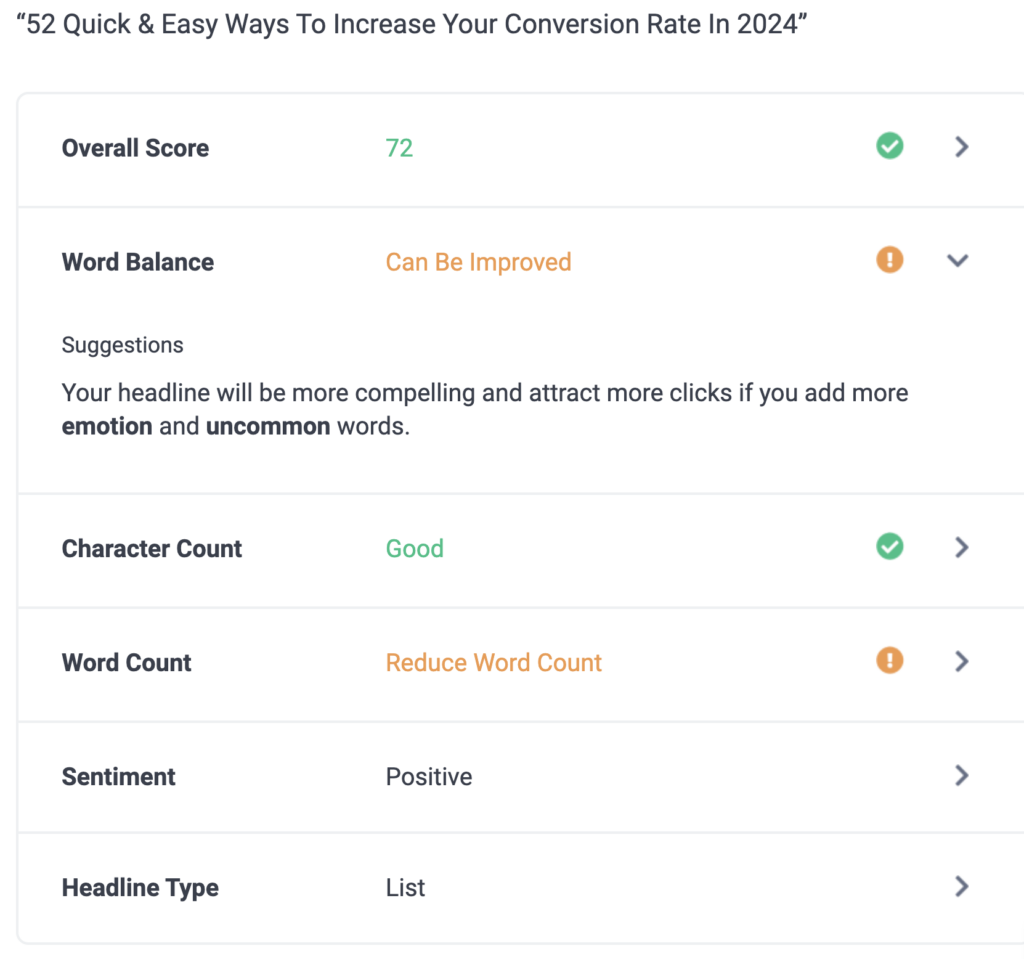
A clear, attention-grabbing headline will encourage users to check out what you have to offer.
2. Write Copy That Talks to Your Readers
Let’s be honest, your customers don’t care about you or your business. They only think about the benefit they can get by using your product.
When you write copy, make sure it appeals to your readers. Highlight the benefits of your product and how it can improve your customers’ lives.
You can make your copy more customer-focused by using “you” and “your” instead of “we” and “our.”
We have discussed this in detail in our blogging strategy guide.
3. Use Bullet Points
People don’t usually read the full content of a blog post or webpage; they like to skim through. Using bullet points makes your copy very scannable.
Bullet points make your copy easy to understand and help your readers quickly absorb the information.
When creating webpages or writing a blog post, summarize your product’s benefits using bullet points.
Read more on how to write the perfect blog post.
4. Stay Away From Jargon and Use Simple English
You can’t increase your conversions if your readers can’t understand what you’re writing.
Use simple English in your copy so that readers can easily understand the message you’re trying to convey. You can convince your readers to take action that you want if you use words that are easy to understand.
Avoid using technical jargon. Your copy’s objective is not to impress your readers with your vocabulary but to help them understand your product, company, and website.
There is no point in writing copy that requires a dictionary to understand it. Keep it simple enough that even a fifth-grader can understand your words.
Pro tip: Use the free web app hemingwayapp.com to check the readability of your content.
5. Add Videos
Adding videos on your website gives your users more information about your product and helps them convert.
It also works wonders if you offer something complicated. A video can help explain things better.
For example, Descript displays a video on the homepage of their website to explain how their audio and video editor tool works.
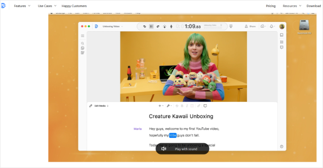
But be sure not to make the videos more than 2-3 minutes. No one has the time to watch long videos.
6. Add Relevant Images
Images grab the attention of your readers. If you want to keep them hooked, then use relevant images.
But don’t just add images for the sake of it. Only use high-quality, relevant, and meaningful images.
Avoid using ugly stock images that may send the wrong message to your audience. Picking the right blog images can help make your blog look good and get you conversions.
7. Send Emails and Newsletters
Sometimes it takes more than one step to convert a visitor. This is why I always recommend email marketing.
With email marketing, you can have direct communication with people that are interested in what you’re offering.
You can begin by educating your prospects and building trust through emails. A good start would be to send an email that answers the top ten most asked questions about your product.
You can also send your latest blog posts, special discounts, tips and tricks, or behind-the-scenes info.
When you build relationships with your audience through email marketing, they’ll be more likely to convert.
8. Automate Your Email Marketing
When doing email marketing, you won’t get great results if you’re just sending off emails manually, one-by-one. If you want to increase conversions with email marketing, you need to automate the process.
For example, drip marketing is a strategy that automatically sends or drips email messages to subscribers over some time to keep them engaged in your sales funnel.
Though this may take some time, it can guide customers to make a purchase if done well.
Our go-to tool for drip marketing is Constant Contact. It’s one of the fastest-growing email marketing services in the world.
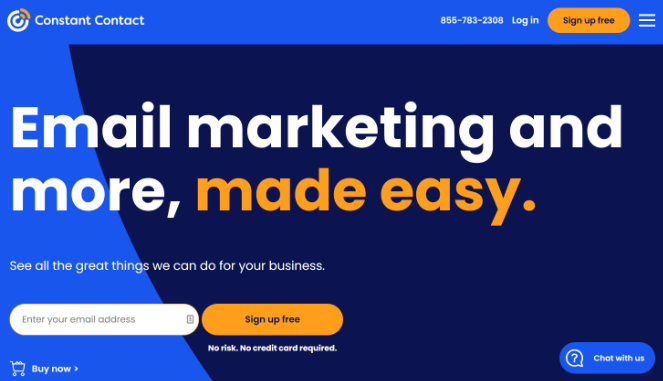
Constant Contact comes with powerful features like email automation, drip campaigns, surveys and polls, coupons, and subject line A/B testing, which help you send targeted emails and maximize your open rate and conversion funnel.
To learn more, check out this guide on drip email campaigns.
9. Offer a Lead Magnet With a Clear Value Proposition
Lead magnets are a great way to get more email subscribers.
A lead magnet is a free gift you offer to your visitors to help them convert.
People are more likely to convert if they get something valuable in return and a lead magnet offers precisely that.
An excellent example of a lead magnet is an ebook that offers a great value proposition to your visitors. You can easily create an ebook by repurposing your old content using a tool like Print Friendly.
Here is an example of a lead magnet:

Check out this tutorial on how to create a lead magnet for step-by-step instructions.
10. Try Different Offers
Remember, your lead magnet offer must appeal to your audience. Having the right offer has a significant impact on conversion rates.
For example, if your visitor was reading a blog post on how to start a blog then it would make sense to show them a lead magnet that has a complete blogging checklist.
This will increase your chances of conversion since the lead magnet is relevant to what the visitor was looking for.
People often focus on designing landing pages and copy, and they overlook the importance of choosing the right offer.
Even if you have picked the best design for your landing page with a compelling copy, you might not get the conversions you hoped for.
In that case, cycle through different offers until you find the right offer that clicks with your audience. Continue to experiment with various offers until you find a winner.
11. Add a Popup To Your Site
One of the best ways to convert your website visitors is to create optin popup forms.
And when it comes to creating high-converting popups, OptinMonster is the best in the market.
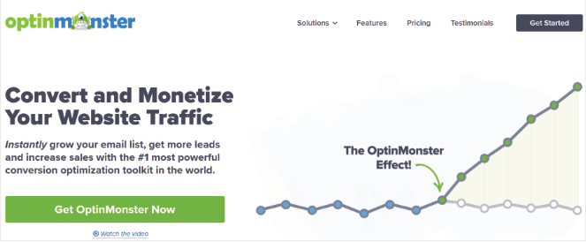
With OptinMonster, you can easily create visually stunning offers with their pre-designed templates and drag-and-drop builder.
Here is an example of an email opt in popup created with OptinMonster:
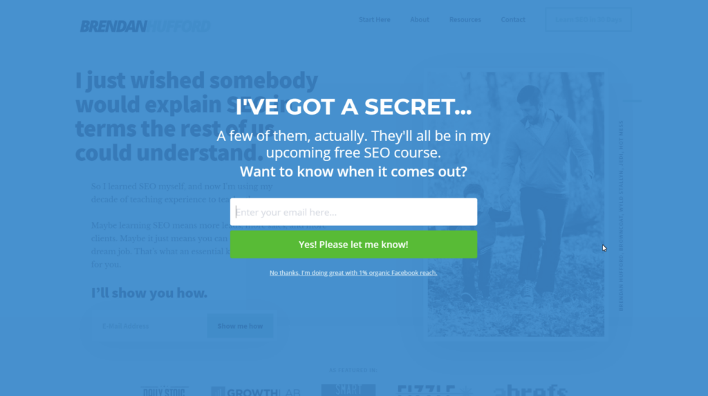
Like this example above, you can also use their Exit-Intent Technology to dramatically increase your conversions.
Exit-intent popups show when the user is about to exit your website, so you can easily recover 53% of your abandoning visitors.
Here are a few more powerful OptinMonster features:
- Geo-Location Targeting – Increase conversions by creating campaigns based on the visitor’s location.
- Page-Level Targeting – Customize your campaigns based on the page or section of your website.
- MonsterLinks 2-Step Optins – Convert any link or image into an optin form. Proven to boost conversions by 785%.
- A/B Testing – Test out your optin campaigns to see which ones convert best.
Many people think popups are annoying but with these features, you can increase conversions with zero complaints from your visitors. You won’t annoy anyone and keep all the benefits.
12. Add Forms
Adding forms to your blog can be very beneficial. You can collect email addresses, get payments, get your potential client’s details, and more.
Adding a form to your WordPress blog can be a little tricky, which is why I recommend WPForms.

They have a fantastic drag-and-drop form builder tool that lets you create forms easily in a matter of minutes.
Forms help you interact with your visitors, and higher interaction leads to higher conversions.
For example, you can create a contact form on your site so that users can message you with any questions they have about your business.
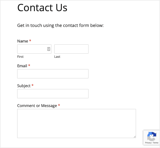
You can then reply to the people that contact you and provide them with the information they need in order to convert.
13. Remove Unnecessary Form Fields
Forms are good for conversions only when they aren’t annoying. A poorly designed form can push your visitors away. Make sure that you give it some thought when creating your forms.
Don’t ask for too much information and keep it simple. Don’t expect your visitors to fill out lengthy forms; they take too much time.
Before adding fields, ask yourself if you really need this information.
A case study revealed that adding an extra form field can reduce the conversion by 11%. That’s a lot!
14. Offer Auto-Complete Fields
We’ve established that the more form fields you have in your form, the fewer conversions you will receive. But what if there is no other way? What if your form is long and necessary?
The solution is to offer auto-complete fields. For example, if a visitor enters a zip code, the entire address will automatically be pulled. This requires less typing for the customers and encourages them to complete the form.
Luckily, WPForms offers auto-complete fields as well as other features that will improve the user experience.
15. Make Your Search Bar Prominent
Search bars play an essential role in reducing the website’s bounce rate. The bounce rate is the rate at which people abandon the website.
Users look for the search bar when they have trouble finding the necessary information. If they can’t find the search bar, they will leave and look on someone else’s website.
Ensure that your search bar is prominent on your website, making it easier for your visitors to find what they are looking for.
Users typically search for the search in the top right or top left corner. It’d be best if you follow the same method.
16. Include a FAQ Page
The FAQ page is another source of information besides the search bar. Add a FAQ page on your website that answers every common question your visitors may have.
You need to look from your visitor’s perspective and consider the questions your visitors would generally ask. What information do they need to convert?
Then, create a page that answers all of those questions.
Here’s an example from Nintendo Switch:
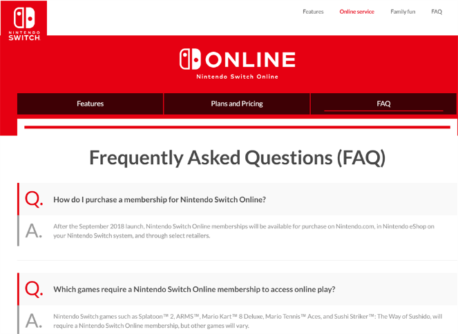
You can easily create a FAQ landing page using a tool like SeedProd.
17. Optimize Your About Us Page
Provide a factual history of your business, how it started, and who operates it on your ‘About Us’ page. People trust companies that have a face and a story.
This makes them comfortable interacting with your brand. They feel like they are talking to a real person with real interest. It also helps build trust with your customers.
How does this help with conversion? As I said, people are likelier to do business with trustworthy people. And if you’ve created your About Us page correctly, you can build trust and get more customers.
18. Create Visually Appealing Landing Pages
A landing page is a page that addresses one specific message for your visitors. It includes a single call to action. Its entire purpose is to collect the visitor’s contact information or make a sale.
You can use SeedProd to easily create a landing page to send traffic to and see higher conversion rates.
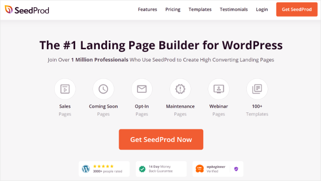
SeedProd has an excellent drag-and-drop page builder tool that lets you create landing pages with a lot of ease. They also have templates that you can use to save time.
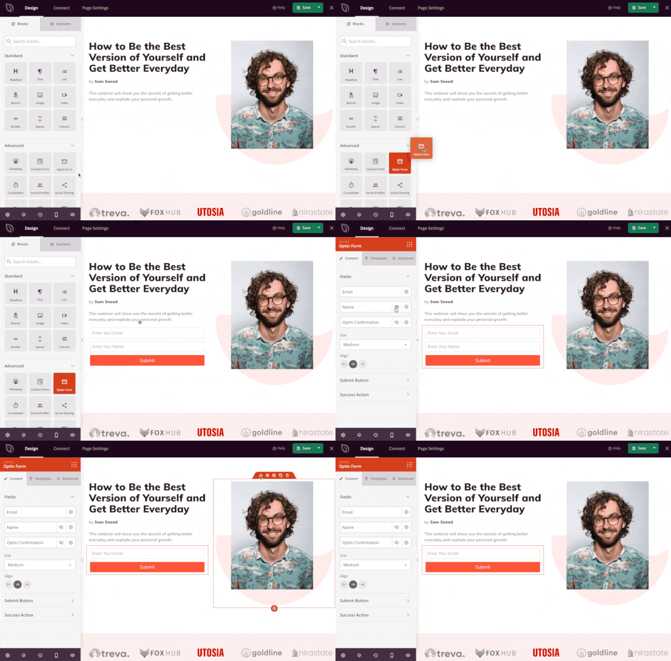
Make sure that your landing page doesn’t have too many options and focuses on the primary goal.
Add all the necessary information to your landing pages so your visitors don’t have to navigate away to find the answers they seek. This can seriously lower your chances of getting conversions.
19. Add CTAs
A CTA is a call to action. It gives directions to your visitors on what to do next. Whether they click a button, read a blog post, or fill out a form, CTAs will help your visitors convert more easily.
For every page on your site, you need to ask yourself, “What do I need the readers to do?” Do you need them to book an appointment? Download an ebook? Fill out a form? Watch a video?
Decide on what action you want your customers to take and add a clear CTA to your page.
20. Strengthen the Copy of Your CTA
Generic CTA texts like “sign up” or “start trial” don’t convert well anymore. Spend a little time thinking about how you can improve the copy to improve your website conversion rates.
You could paint the offer in a positive light by starting with the word “yes.” For example, your CTA text could look like this, “Yes, I Want 70% Off!”
It doesn’t necessarily have to be the same as the example above. The point is that you need to think this through and write a copy that drives action.
21. Choose the Right Color For Your CTA
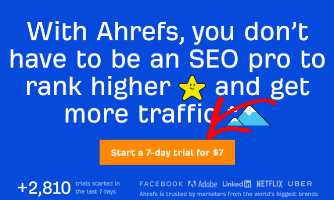
Your CTA color should contrast with the color of your background. This helps your CTA visually stand out from the rest of your page.
Test different colors and see which looks best. For example, if you have a blue background, then an orange color would be a great choice for your CTA.
Here’s how Ahrefs does it:
22. Optimize CTA Placement
It’s ideal to always place CTA at the beginning of your landing page or your blog. Most users don’t scroll down the whole page and they’ll miss your CTA if you’ve placed it down below.
In our opinion, the best approach is to place your CTAs multiple times on your page so that there isn’t any chance of your readers missing them.
23. Make The Initial Step Really Easy
There is a human psychology principle that states that people prefer to finish things that they start.
So when you are presenting an offer, make sure that the first step is easy to complete.
Instead of asking your customers to fill out the entire form, ask for simple things like their email addresses.
You can then proceed to send the form in hopes of getting more information, but even if you don’t, you still have their email address.
The easier you make the first step, the greater chances of converting your visitors.
24. Add Testimonials, Reviews, and Logos For Social Proof
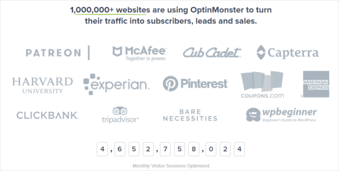
People are reluctant when they’re trying out a product for the first time. But, you can put their mind at ease by providing testimonials or reviews from past customers.
You can also add logos of companies that have mentioned your product. This instantly builds trust with new customers:
25. Showcase User-Generated Content
You will often see brands boasting user-generated content on their social platforms, websites, and other marketing channels.
User-generated content is any form of content, like images or videos, that’s been posted by users online. Think of when a user posts a picture on social media of the new Nike shoes they bought—that’s user-generated content.
Why should you showcase user-generated content? Because it promotes authenticity, boosts credibility, creates trust, and drives purchasing decisions. When people see that other people are happy with a product, they’re more inclined to purchase it too.
To showcase user-generated content on your website, you can use Smash Balloon. Smash Balloon lets you easily embed your social media feeds on any area of your site.
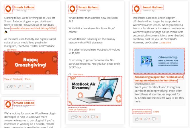
You should check out the hashtag feeds of Smash Balloon. You can show feeds where users are mentioning you on social media. This will give a boost to your social proof and it will make your visitors feel more confident engaging with your blog and your services.
26. Post on Social Media
As a brand, you need to make sure that you have a strong social presence on social networks that make the most sense for your business.
Make sure to always share your blog posts on all your social channels. This shows that you actively use social networking sites and regularly engage with your target audience. Plus, it will drive more traffic to your posts, which will help you get more conversions.
You should also encourage your visitors to share your content on their social networks. You can make sharing easy by using a WordPress plugin called SharedCounts.
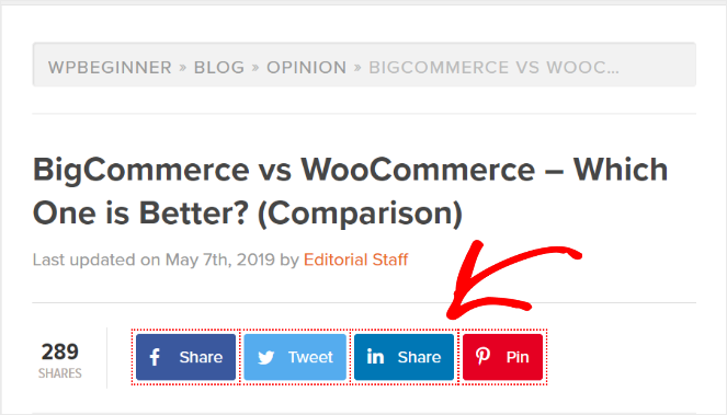
It also shows the number of shares your blog has, this helps build a good rep with your readers.
27. Monitor Your Social Channels
Social channels are a great way to identify potential customers who are ready to make a purchase.
Potential customers who are searching for information about your brand expect you to be active on social media. Answering their queries will help not only to improve your conversions but also build social proof.
You can search for your brand keywords on social media and see what comes up. If you happen to find questions related to your business, you should answer them. These questions and social conversations can quickly lead to a sale.
28. Add a Live Chat To Your Site
Adding a live chat to your website can do wonders. It’s one of the most satisfying customer service channels for users.
Your visitors may have a few questions before making the final decision; having a live chat can help eliminate any concerns your potential customers may have.
Plus, live chat works come in very handy if you have a complex product. Users can get answers to their questions immediately so it can help get conversions.
The easiest way to add live chat support to your WordPress blog is through a tool like LiveChat.
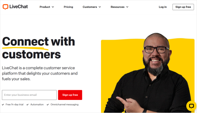
It offers loads of customizations, it’s easy to install, and it integrates with many third-party tools.
29. Run Giveaways
Running a viral giveaway is another good way to convert visitors into subscribers and customers.
In fact, KnivesShipFree.com ran a giveaway and boosted revenue by $10, 118.20! With giveaways, you can attract a ton of new users to your site and while they’re there, you can convert them.
You can easily run a giveaway on your WordPress blog using RafflePress.

With RafflePress, you can build giveaways quickly with their drag-and-drop giveaway builder.
Plus, RafflePress has verified bonus actions to help you increase conversions. Users can get extra giveaway entries for performing actions like joining your email list, watching a video, visiting a specific page, and more.
Here is an example of an iPad Mini giveaway built with RafflePress:

30. Offer a Money-Back Guarantee
Having a money-back guarantee shows your business is confident about your product, which increases trust.
This makes it easier for your potential customers to try your product risk-free, and they are more inclined to purchase it.
If the industry standard is 15 days, then one up by offering 30 days of money-back guarantee.
31. Add a Countdown Timer
Creating a sense of urgency is another excellent way to boost your conversions. It’s natural to become anxious when time is running out and it makes people act faster. Adding a countdown timer to your site is just what you need to capitalize on this feeling.
You can easily add a countdown timer to your popups with the help of OptinMonster.
Take a look at the example below:

Adding a countdown timer to your site will encourage people to convert quickly.
32. Display Live Sales Notifications
Displaying live sales notifications is another great way to boost conversions.
When visitors are browsing products on an online store, a notification shows up on the bottom left or right that says that someone bought a particular product from a specific region.

This encourages visitors to take the same action!
The best way to add live sales notifications to your site is with TrustPulse. TrustPulse is easy to set up and you can show notifications for any action on your site like purchases, email newsletter signups, demo registrations, and more.
33. Use Push Notifications
Push notifications present a great way to communicate with your audience, and they also have a high conversion rate.
A push notification is an alert that you can send to your straight to a user’s web browser or mobile device.
You can send out notifications for new blog posts, product announcements, abandoned cart reminders, and more, to drive traffic back to your site and boost conversions.
I recommend using PushEngage to enable push notifications for your site.
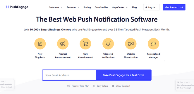
PushEngage offers powerful personalization features, A/B testing, advanced analytics, and it works with multiple browsers. Plus, PushEngage offers a free plan so anyone can get started.
But keep in mind that you don’t send too many of these notifications or your readers will opt-out.
34. Ask for Referrals
Asking your existing customers if they know someone else who might want to use your product is a good way to boost conversions.
In return for this referral, you can offer special discounts.
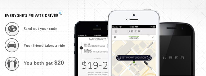
Uber is a good example of brands asking for referrals, every time an existing customer would refer to someone else, they would get a free ride.
35. Show Gratitude
Being human is all it takes to improve your relationship with your subscribers and customers. It won’t hurt to show some gratitude every now and then.
You could email your subscribers on their birthday or their anniversary. Or simply say thank you for trying out your product even when they did not make the purchase.
Showing gratitude can go a long way towards building loyalty, and that loyalty can bring in a lot of direct and indirect conversions in the future.
36. Tell Success Stories
Case studies on how your product or service has helped your customers is another way to improve your conversions. This can grab your visitor’s attention and influence them to make the purchase because they can see the success others had.
OptinMonster often publishes case studies that highlight the success of their customers. This encourages new customers to try OptinMonster without any hesitation.
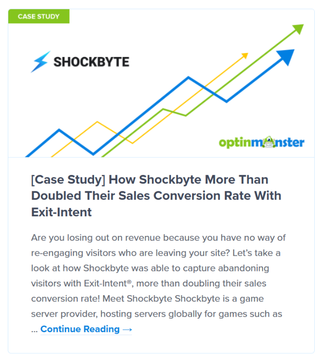
Check out this guide to creating awesome case studies that convert.
37. Conduct Customer Surveys
Customer surveys let you get feedback from people who have purchased your product. It can give you insights and help you understand the improvements you need to make to your product, which can help you improve conversions in the future.
You can also conduct visitor surveys. You can ask your website visitors how you can improve your site or you can ask questions to learn more about them. This will help you understand what your audience needs, so you can convert them easier.
WPForms is a good option if you want to run surveys on your blog. With WPForm’s Surveys and Polls Addon, you can easily create survey forms and analyze the data with interactive reports.
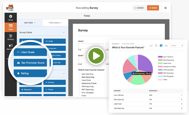
When you have gathered enough data, you can make the necessary changes and boost your conversions.
38. Display Popular Products and Posts
If you want to boost conversions, try displaying your most popular products on your site.
When visitors see your popular products, as well as reviews from happy customers, they’ll be encouraged to head to the checkout themselves.
You can also display your most popular blog posts or product page. By driving more traffic to your best content, you can get more email signups, affiliate link clicks, social shares, and so on, which leads to more conversions.
You can easily showcase your popular products or posts anywhere on your site using MonsterInsights.
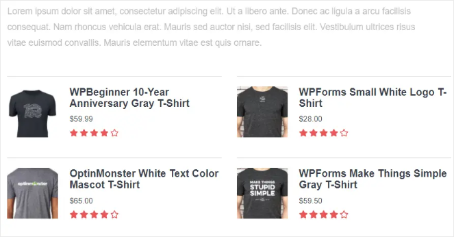
With MonsterInsights’ Popular Posts/Products feature, you can select which popular posts you want to display and customize the look to match your site’s theme.
39. Add a Point of Purchase Upsell and Cross-Sell
This tip isn’t strictly to help increase your conversion rate, but it does increase your overall revenue.
For example, if a customer is ready to make a purchase, you can offer a similar product or a service that can be added to their cart with a single click. This is called upselling.
Cross-selling is when you offer a product that complements their current purchase. For example, you could offer a pair of headphones for someone who just bought a cell phone.
This one neat trick can help you increase your revenue by 10-20%! But before you get to that, you will have to experiment with different offers.
40. Focus on Reselling
Resell your existing customers the same product that they purchased in the past. Since they have already enjoyed your product, they will be more inclined to re-purchase.
Reselling is easy. You already have the email of the customer who has used your product in the past. All you need to do is send them an email with a special offer. For example, offering them a 20% discount, anything that catches their attention should do the trick.
41. Offer Free Trials
Sometimes, it is best to let your potential customers try your product for free in some cases. You can offer them to try your product for 30 days without any charge like Amazon Prime Video does.
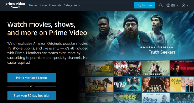
This will give them time to thoroughly test out your product, and if it’s good and delivers on its promise, there is a good chance they will purchase it.
Use the drip marketing technique I discussed previously during the free trial period. Interact with your subscribers and ask them if they are enjoying your product or if they need help with anything. Tackling their pre-sales questions as early as possible will give you a good chance of a conversion.
42. Run Pay-Per-Click Campaigns
Running a Pay-Per-Click (PPC) campaign is when you pay websites or search engines like Google to show your ads about your website.
You only pay them if the visitor clicks on your ad and lands on your page.
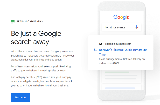
You can use PPC campaigns to drive traffic to your website and help convert users.
43. Create Dedicated Pages for PPC Ads
For every PPC campaign, make sure that you have a dedicated landing page where your visitors can land.
Having a dedicated landing page helps with conversions as it has little to no distractions. A PPC landing page should not have any other links except the CTA. If you present your visitors with too many options, they will get distracted and leave.
44. Be Consistent
Keep the message and the look of your landing pages consistent with your ads and the website. The visitor should see the same message on your landing page that they saw on your ad when they clicked.
You need to make sure that you deliver on the promises you made in your ads; otherwise, you will lose conversions and earn a bad reputation among your customers.
45. Make your Website Responsive
As per research, in 2022, 80% of visitors will come through mobile devices. If your website isn’t responsive, you will be losing 80% of your potential customers. No business can afford that kind of loss.
So make sure that your website is responsive and works on all mobile devices.
This is easy if you use a responsive WordPress theme.
46. Improve Website Loading Time
Your website loading time should be less than 3 seconds. Anything over that and you will start to lose customers.
The loss of conversions and sales are directly related to high website load times. Research by Amazon states that for every 1-second delay, you lose 7% of your conversions.
Having a high load of time also affects your SEO. Google and other search engines discourage websites that take too long to load and drop them in search rankings.
If you don’t want to lose your rankings and conversions, it’s best to optimize your website for higher speeds. You can quickly check your website speed using Google’s PageSpeed Insights tool.
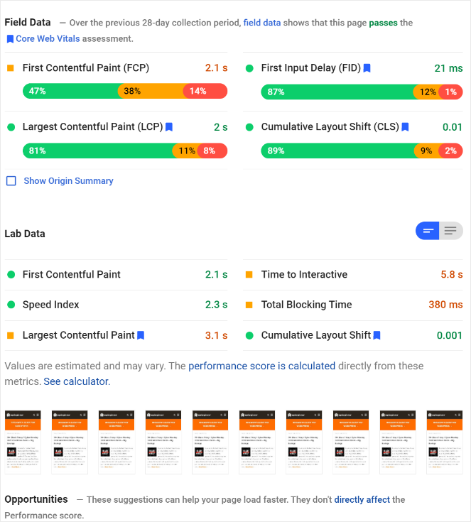
If you want to improve your website’s speed, you should check out our guide on 10 ways to improve your site speed.
47. Avoid Having Intrusive Ads
Often blog owners rely on displaying ads to make money. Though there is nothing wrong with that, bloggers should ensure that having ads doesn’t affect the overall blog experience.
Having too many ads on a single page is not only intrusive, but it also looks spammy. Your visitors will quickly hit the back button before reading a single word. If they leave your site due to annoying ads, you won’t be able to convert them.
48. Track User Behavior
You can use Google Analytics to track user behavior on your blog. With Google Analytics, you will be able to tell how your visitors interact with your website. You will know exactly how much they spend time on your website, which pages they visit, from which region, etc.
With this data, you can make sound decisions on how to improve your website to drive more conversions.
You can get all of this data and more in your WordPress dashboard by using MonsterInsights.
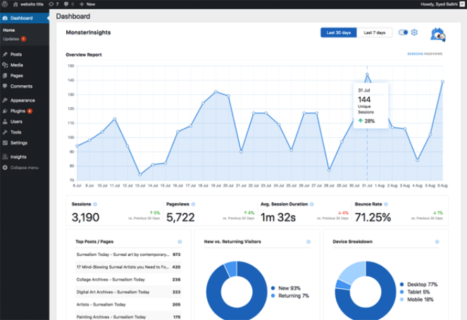
MonsterInsights is a Google Analytics plugin for WordPress. Having this plugin makes it very easy to analyze this data and make decisions based on it.
49. A/B Test Your Blog Elements
You should test different variants of your blog elements. By blog elements I mean your blog’s design, CTA color, copy and placement, headlines, popup designs and copy, etc.
Different people have different preferences. You may like your blog’s design but your visitors may feel different about it.
To be sure about what works and what doesn’t, always do A/B testing. Make two different versions of your blog’s design and then test them out.
You can use MonsterInsights to see which design had the most visits and stay time. Pick the one that has better statistics.
You can also test out your CTA and signup forms performance using MonsterInsights and Google Optimize.
You can read the full guide on how to integrate these to tools here.
50. Use Eye Tracking
Wouldn’t it be cool if you could tell the first place your visitors saw when they first landed on your website? With an eye-tracking tool, you can do just that. With the right tool, you can tell which is the first thing that caught your visitors’ attention.
You can then strategically place valuable information or CTAs so that it gets maximum attention.
51. Use Heatmaps
Heatmaps are similar to eye-tracking tools, but instead of tracking eye movements, it tracks mouse clicks and hovers.
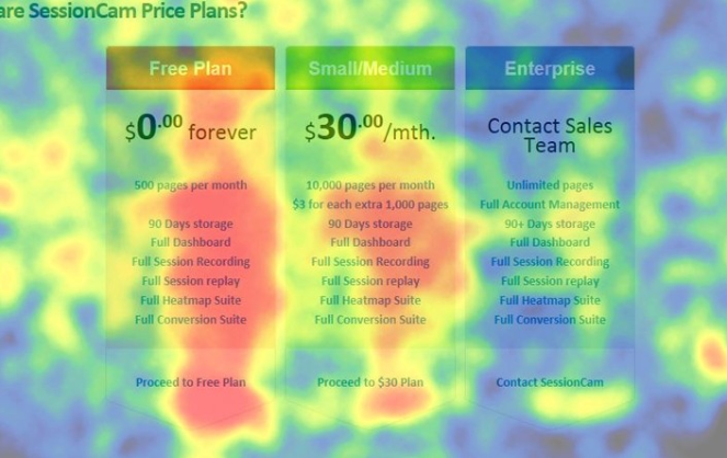
With the help of heatmaps, you can analyze whether people are paying attention to the elements you want them to focus on.
For example, if you have placed a CTA in your content, but the heatmap shows that it isn’t getting any attention, you need to change the copy or the CTA color.
Check out these popular heatmap tools and plugins.
52. Test Your Site’s Usability
Is your site easy to navigate? Even the best-looking websites can be difficult to navigate. It’s best to test the usability by asking your peers to review your website. If you see them having trouble navigating it, then it’s time for a redesign.
Usability testing also means ensuring that everything works as it should. For example, your dropdown menus should work, your CTA’s link should not be broken, etc.
Thoroughly test your site’s usability and ensure your visitors can easily navigate your website.
Boost Website Conversions Today!
Well, there you have it. These were quick and easy ways to increase conversions on your blog. If you have any tips to share, then do let us know in the comments below.
If you liked this article, then also check out our guide on how to make money online.
Also, don’t forget to subscribe to our newsletter for more blogging tips.

0 Comments
Join in. The comments are closed after 30 days.