A re you trying to find a way to make alluring graphics for your blog posts and social media? In this article, we’ll compare Canva vs. Adobe Creative Cloud Express for making graphics that are fast, easy, and free.
Good news! It’s easier than ever to make beautiful graphics.
When starting a new blog, in the past, making graphics for it was hard. You’d need design training and expensive software. Or you’d have to spend a lot of money on a designer. Those have their place, and sometimes it pays off to invest in new skills or hire a pro.
But sometimes you need graphics fast.
With Canva or Adobe Creative Cloud Express, you can make graphics all by yourself. They offer powerful design tools that work right inside your web browser. No downloading complicated apps required!
Which one should you use? Short answer: both are amazing and pretty equally powerful.
To help you choose which tool is best for your needs, we’ll compare Canva vs. Adobe Creative Cloud Express and make some recommendations.
Let’s get to it!
In This Guide:
What is Canva?
Canva is a super popular online design tool. The company was started in 2013 and it’s based in Australia.
The Canva design tool is browser-based so you can use it with your favorite web browser. Canva makes it easy to work with layered graphics to produce professional results.
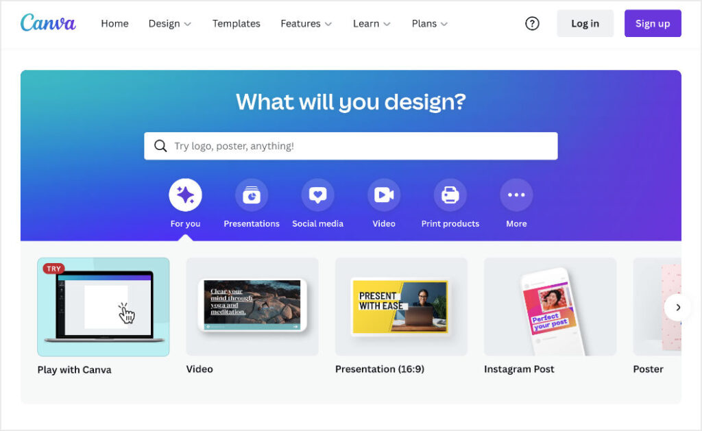
Using the Canva web app is similar to using professional design software like Adobe, Affinity, or Sketch. But it’s way easier to use.
You don’t have to download and install any software. You can jump on and work from any computer, anywhere, as long as you have an internet connection.
Canva has a free version that can do most of what you can ever imagine needing. You can easily get started with pre-made templates or make custom graphics from scratch.
It’s quick, free, and easy. But you can achieve professional design results.
You can imagine why Canva has grown very popular very fast. They have more than 60 million users. It’s estimated 500,000+ of those users are paying users.
There is also the Canva Pro plan that comes with advanced features for individual users or teams. They even offer Canva Pro free to registered NGOs and non-profit organizations.
What is Adobe Creative Cloud Express?
Adobe is a very established software company. They specialize in design and creative software. They’ve been around since 1982. Their headquarters is in the Silicon Valley (San Jose, near San Francisco in California).
Adobe makes the industry-standard Photoshop. They also make the incredibly powerful (but expensive) ‘Creative Cloud’ app family. This includes Illustrator, InDesign, Premiere Pro, and AfterEffects.
Creative Cloud Express (CCE) is, actually, a rebrand of an existing product called Spark.
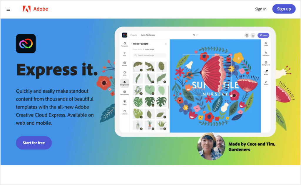
CCE is quite similar to Canva. Maybe a little too similar. It kinda seems like CCE is Adobe’s answer to Canva. This would be for good reason. With the incredible growth and popularity of Canva, Adobe is at risk of losing a HUGE segment of the design market.
So, yes, it works the same. CCE is a design app, it works in a browser, no software downloads or installs. It feels more fun to use and more easy to use than their other Creative Cloud Apps. Cuz, Canva!
🎨 Get a free Adobe Creative Cloud Express account
Note: If you currently already have an Adobe account for other products like Photoshop or Creative Cloud, you can use that login. Be sure to use your existing account if you have one to take advantage of integrations.
Now that you know more about what these tools do, let’s go over why you need them…
Why Do I Need Canva or Adobe CCE?
There are lots of reasons you need a design tool like Canva or Adobe CCE as a blogger.
Here are two big ones:
- To make your blog appear more authoritative and professional
- To help you stand out on social media
You can use these apps to make professional ‘featured images’. What’s a featured image you ask? That’s the image at the top of your blog post. It’s also the image that appears when you share your post on social media.
Featured images attract attention to your post. They also communicate the vibe and content of your post.
Many bloggers use free stock photos as featured images. But, with tools like Canva and Adobe CCE, you can easily create custom featured images that match your brand.
Aside from featured images, you can also use design tools to create eBook covers, company logos, lead magnets, infographics, and much more.
Ready to get started?
In the Canva and Adobe CCE quick tours below, we’ll show you how you can use each design tool to create beautiful images for your blog.
Quick Tour: Canva
Once you have a Canva account set up and you can log in and get started designing in one of several ways.
There is a ‘You Might Want to Try…’ section with popular tasks like Instagram posts or posters.
For today’s example, we’ll start with a blank slate. We’ll click on the purple Create a design button on the top right.
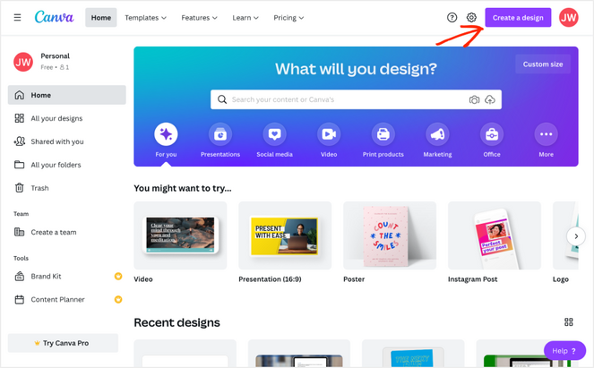
We’ll skip past the suggestions and choose Custom Size to create a featured image for a blog post.
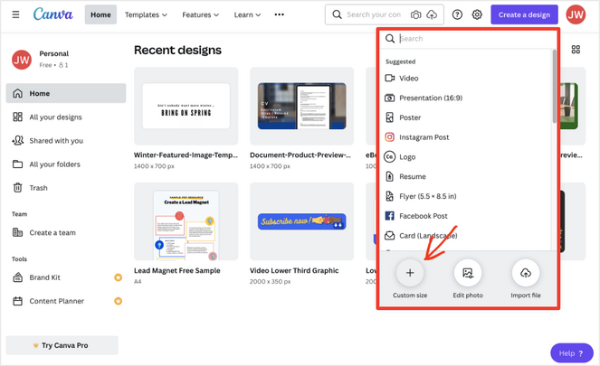
What Size Should I Make My Featured Image?
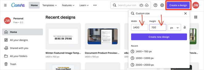
It depends on your blog. But if you’re not sure, a good starting point is something that is 2:1 in its aspect ratio. That’s twice as wide as it is tall, a bit like a TV.
Go with 1400 pixels wide by 700 pixels tall. Most website and social media content display areas are 600-700 pixels wide. By using double the resolution needed, you assure the image will look sharp on devices with high pixel densities (like iPads with ‘Retina’ displays).
Set the image size document at 1400 pixels by 700 pixels and then click Create a new design.
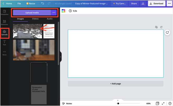
Next, we’ll add a wintery photo for a background. We’re going to make something about winter and spring.
Click on Uploads on the left-side menu. Then click on Upload media. We’ll upload our photo and add it to the design.
After that, we’ll add a text box. Click on Text. You’ll find all sorts of cool text options. Lots of great font pairings, probably made by professional designers so you don’t have to!
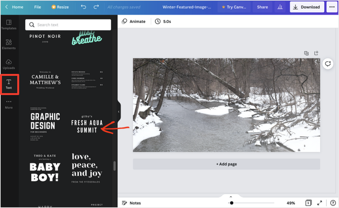
We’ll add some text and customize the fonts, colors, and add a shadow. This is all controlled by the Effects button on the top menu.
This anti-winter graphic is looking fun. But it’s hard to read some of the text. Next, we’ll add a rectangle shape. There are lots of options for shapes and premade graphics under the Elements menu.
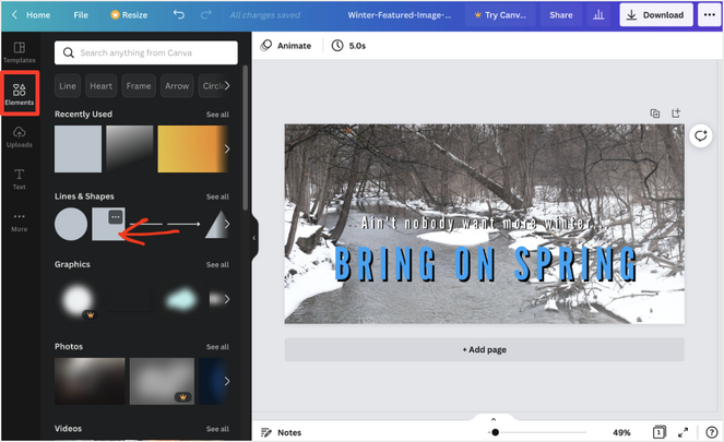
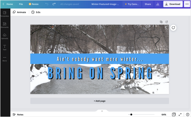
We’ll make a blue bar behind the top text so it’s easier to read. And, just like that, we have a pretty cool-looking graphic. That took just a minute, and this is pretty rushed. Imagine what you could do in thirty minutes!
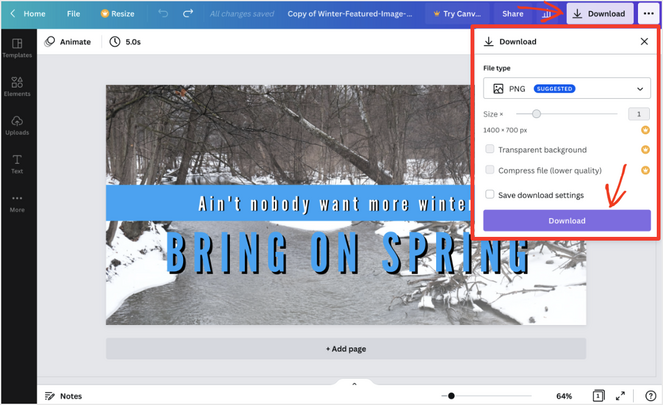
When you’re ready to share the image just look for the Download button at the top-right. You can save PNGs, JPEGs, and PDFs from graphic designs.
Even with the Canva free plan, you can convert your design into a template that can be shared with anyone. All they need is a free Canva account.
This feature is far superior to Adobe CCE’s ‘Make a Template’ button. You have to invite people one by one, no public links, and you have to have a Premium plan to access templates. Canva has CCE beat big time here!
All you have to do is click the Share button. Then select the Share a link to use as template option. It’s awesome!

You can even use this feature to make money online!
Learn how to sell Canva templates on your WordPress site for free with Easy Digital Downloads.
You can also share an Edit or View link with anyone who has a Canva account. Similar to how you might do in Google Drive with a Document.
Great! That’s a quick tour of Canva. It’s pretty easy and fun to use. You can experiment as much as you want. With all the free premade elements, you can make something cool pretty quickly.
Pros of Canva
- Intuitive and easy to use, slightly easier than Adobe CCE
- Make and share templates with the free plan, better than Adobe CCE
Cons of Canva
- Pro is $120/year or $13/month, more expensive than Adobe CCE
- Harder to control layouts with layers than Adobe CCE
- Image transparency and remove background features require the paid Pro plan, but it’s free in Adobe CCE
Up next is an Adobe Creative Cloud Express quick tour. You’ll find it’s pretty similar to Canva. But there are also many differences.
Quick Tour: Adobe Creative Cloud Express
After you set up a free Adobe CCE account, you’ll find the home screen is a bit similar to Canva. You’ll be given prompts to take a ‘quick action’ from one of the presets like resizing an image.
You’ll also see options to start from a template, and if you have any recent projects they’ll show up on a banner at the bottom of the page.
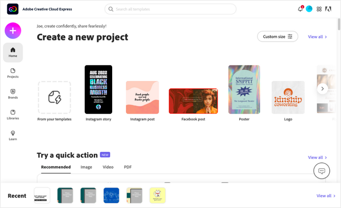
For this quick tour, we’ll start fresh with a new document by clicking on the big pink-lavender “+” button in the top-left corner.
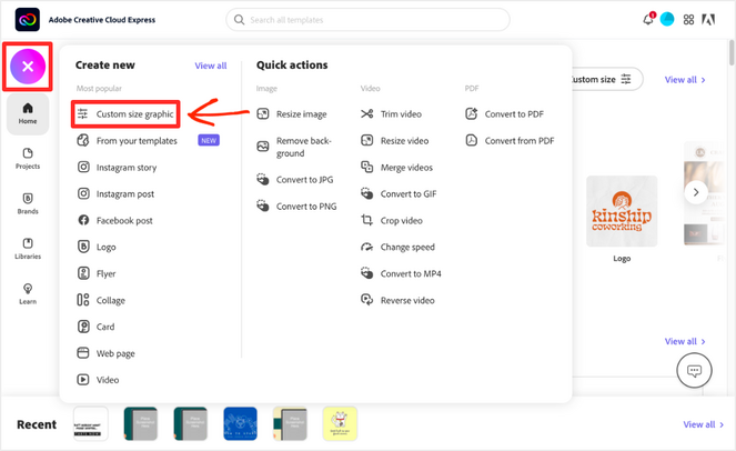
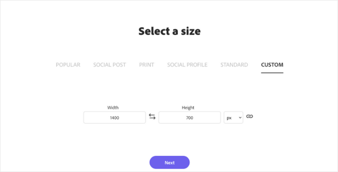
Next, we’ll choose a Custom size graphic. We will set the size to 1400px by 700px.
Now we have a blank canvas to have fun with. We’ll make a graphic similar to the one we made in Canva. Click on the blank background. On the right-hand side, an Edit Background menu will appear.
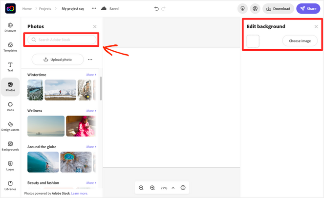
Then way over on the left, we’ll click the Upload Photo button and upload the same wintery photo we used last time.
Now let’s add some text. Click on the left-side menu on the Text button. You can search for preset styles or just scroll down until you find something you like. Similar to Canva you’ll see free and premium options. The crown icon means you have to pay for it. It seems like there are a bit more free options on Canva, but it’s amazing how similar it is working with Canva and CCE.
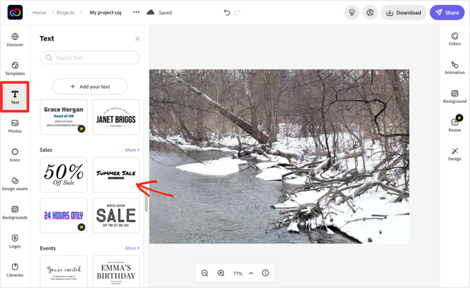
Click on, or drag-and-drop, the text you like and place it on your canvas. For this example, we’ll change the colors and add shadows on the text to make it easy to read. Just like Canva there are lots of creative controls and options.
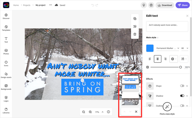
One cool feature exclusive to CCE (for now?) is the nifty Find a new style button. If you click that, it changes the style of your current text element to a new one from the library so you can experiment with cool new ideas. It even retains the color and shadow settings! Wow!
Once we have the text how we like it we’ll add a box to the background using the Design assets tab. All we could find was this ‘brick red’ colored one. You can change the color settings, and we changed it to white. Then we made it partially transparent.
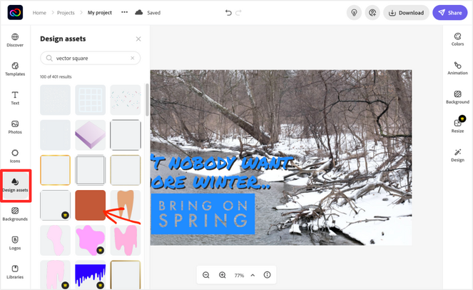
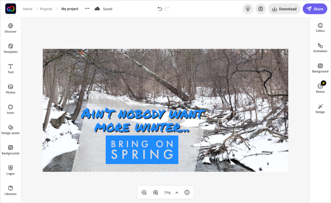
And that’s about it. Here we have a fun little ‘Bring on Spring’ graphic to use as a blog featured image or to share on social media. It’s quite similar to the Canva one, yet different. We couldn’t find the exact same text look-and-feel. Both web apps have different free and paid elements.
One thing that sets apart Adobe CCE is layer control. When you are working with a document with several layers in Canva, things get dicey pretty quickly. It’s hard to select things if they are on top of each other. You’ll find yourself moving stuff over to the edge temporarily so you can access the layer underneath.
Not so with Adobe CCE! They have this elegant layer control interface. It’s similar to their professional apps. This layer control makes Adobe CCE a more powerful layout tool. Very impressive!
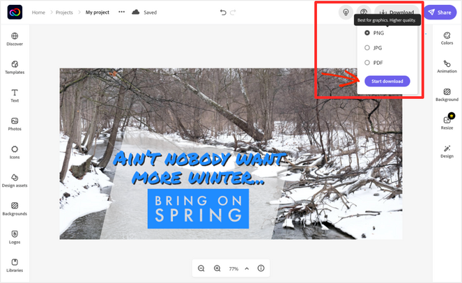
Similar to Canva, you click on Download. From there you can save your design as a PNG, JPG, or PDF. You have to pay for the Premium plan for more export format options.
Adobe CCE gives you a few sharing options.
The purple Share button on the top right lets you:
- Publish – This button allows you to publish a public link that you can copy/paste directly into Facebook, Twitter, Google Classroom, Microsoft Teams, or email or websites.
- Invite – This button allows you to invite other Adobe CCE account holders to collaborate on the same document. Any edit they make will effect what you see, you’re working on the same document.
- Make a template – This feature is currently labeled new. It’s not as powerful as Canva’s template links at this time. You can click it to create a template that saves to your library. Here’s the catch, you have to have a Premium account to see or share the template you just made. So Canva has CCE beat on this feature, no question.
- Send to Google Drive – If you choose to give Adobe access to your Google Drive account you can set it up so you can see and access CCE documents from within Google Drive. When clicked they simply open the document in CCE (assuming you are logged in to both). The Google Drive integration right now is really just a shortcut.

Cool! So that’s a quick tour of Adobe Creative Cloud Express. As you can see, both Canva and CCE are fairly similar and beginner-friendly. Both are fun and allow for plenty of experimentation. Canva is a bit easier to use, but one could argue that’s because it has less granular control over some layout options.
Pros of Adobe CCE
- Premium plans start for less money at $100/year or $10/month
- ‘Find a new style’ button to magically switch text style while retaining color settings
- Amazing layer control panel, superior to Canva
- Image transparency and remove background included in Free plan
Cons of Adobe CCE
- You need a Premium plan to access and share templates
- A bit harder to learn and use than Canva
Canva vs. Adobe Creative Cloud Express: Which One Should You Use?
It’s hard to say. Both Canva and CCE are very powerful. A decade ago, a free, powerful, browser-based tool like this was almost unimaginable. That is to say, you’ll be able to quickly get professional results with either web app that you’ll be happy with.
Which one depends more on what you want to do. The good news is, there’s no major risk. You could use both or switch back and forth. It’s not as big of a decision, as, say, choosing a blog platform.
We’ve done our best to boil it down to two bullet point lists. Whichever one most closely describes you…go for it! No worries, you’ll be in good hands either way.
Use Canva If…
- You care a lot about pre-made templates, there are more available; both from Canva and third parties, because it’s been around longer
- You want to be part of a newer, scrappier, up-start design community
- You want the easiest to use of the two options
- If you don’t care about exporting images with transparent backgrounds (like a logo) or don’t mind paying $120/year for it
- If you don’t care about removing backgrounds from photos for various reasons, or don’t mind paying $120/year for it
Use Adobe CCE If…
- You care less about pre-made templates, while there are many, CCE is behind Canva on this for now, CCE will probably catch up fast
- You want to be part of the Adobe ecosystem, this can improve your design skills, sound good on your resume/CV
- You want the more (slightly more) powerful option of the two even it it take a bit more time to learn
- If you really want to be able to export images with transparent backgrounds (for free even!)
- If you really care about removing backgrounds from photos (for free!?)
Let us know in the comments your thoughts on Canva and Adobe Creative Cloud Express.
Save and export that PNG. We’re done!
We hope that you found this comparison of Canva and Adobe Creative Cloud Express helpful as you build your blog and create amazing content.
If you liked this article, then you might want to check out our guide on image SEO. It includes simple tips that will help you drive more traffic to your blog.
And don’t forget to sign up for our email newsletter so you can get useful content like this sent right to your inbox!

I’m thinking about switching from Canva to Adobe CCE. Your article was just what I was looking for. Thanks for the info on how to sell Canva templates on your WordPress site for free with Easy Digital Downloads.
Thanks David, glad you found it helpful!
Amazing Post.
this is a good, helpful article, thanks for sharing.