A significant portion of my day is spent trying to improve conversions.
That could mean changing colors on a button, split testing some email sign-up forms or re-designing a landing page to see whether I can increase my click through rate.
And one way I get ideas about what I could improve is by looking at what the world’s top websites are doing and seeing if I can emulate some of their ideas or tactics.
In this post I’m going to show you some really clever conversion tricks in the hope that they might make your blog a little bit more effective.
Sound good?
Insights into specific websites
Something I’ve been wanting to do for a while now is highlight and examine individual websites that I come across so that we can learn from their examples and perhaps adopt a few of their clever strategies.
This post is going to go into some deep analysis of a site called Born Fitness.
Actually, the moment I first saw it I instantly knew I wanted to learn more because the sales funnel, testimonial layout, etc. was so strong that I knew there was some clever people behind it. I even tweeted about it:
Just found the @BornFitness website today. Absolutely stunning design and perfectly optimized for conversions. Would love to see data!
— Ramsay (@BlogTyrant) November 11, 2015
At the time of that tweet I had this post in mind and so I reached out to the owners of Born Fitness to see if they’d like to participate by giving away some of their secret sauce stats. Luckily for us they were more than willing to participate – in fact, they gave us some hugely valuable information!
The following italics are some wonderful insights from Jordan at Born Fitness:
Let’s talk about strategy.
When you’re running a business, you should have two questions on your mind at all times:
1) What is our primary goal?
2) How are we failing at our primary goal?
Most people have no issue with #1, although sometimes it lacks enough focus. But #2, that’s where the good stuff exists. By understanding where you are weak, you can find new ways to become stronger and better. That’s why at Born Fitness we strive to take both a quantitative and qualitative approach to conversion optimization.
The quantitative is obvious if you know what tests to create. (More on that in a moment.) But the qualitative? We start by asking, “Why are we doing what we are doing?”
Keep that in mind as we break down the two top performing opt-ins on Born Fitness.
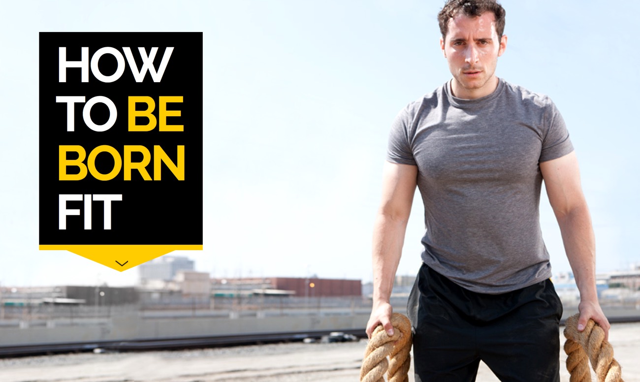
The Welcome Gate Homepage
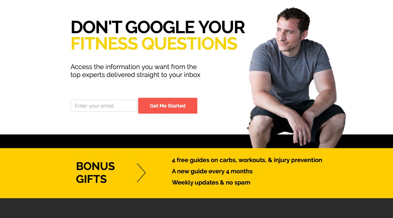
The first time you visit Born Fitness, you are greeted by a welcome gate–but only the first time.

We’re not here to block people from the information they want, so we figure if we can’t convert them immediately with the welcome gate then it’s not worth repeatedly hitting them with the same message. Instead, we’ll try to convert them in other ways once they engage with our content.
The call-to-action on the page is clear and so is the value being offered. You will notice four things right off the bat:
1. The opt-in is above the fold
We are not saying that the opt-in always needs to be above the fold, but rather through our testing we found that the average user scrolled 53% of this page.
Therefore, if you were to put the opt-in at the bottom of the page about half of the people who come to your site will never see it. Want to know how much people are interacting with your page? Try tools such as SumoMe or Crazy Egg.
2. The value is clear
We highlight what you receive after signing up for our email list. There’s no need to get fancy here. Just explain in simple terms why someone should give you their email.
Benefits, benefits, benefits. That’s the name of the game. This is a trade, so make it clear what the visitor will receive and why they should want it. Sure, you want a big list, but you also want a quality list. We highlight what you receive after signing up for our email list. There’s no need to get fancy here. Just explain in simple terms why someone should give you their email.
3. The power of social proof
After adding both testimonials and media brands where Born Fitness has been featured we saw a 22% increase in conversion rate on the page. People need to know that this is a trustworthy source that they feel safe providing their email to.
If you got it, flaunt it. That’s what we’ve found. We tested an opt in + value proposition vs. opt in + value proposition + social proof, and we found a clear winner. After adding testimonials and media brands where Born Fitness has been featured, we saw a 22% increase in conversion rate on the page. People still get that extra comfort when they know your site trustworthy source.
Note: Check out my guide on how to ask for testimonials.
4. No navigation on desktop
Remember how we mentioned focus? The last thing you want is someone being distracted by other areas of your website. Once the user scrolls down on the page, they then have the opportunity to navigate elsewhere. So your job is to keep them focused on what you want them doing on the page.
Right now, we’re seeing over an 8% conversion on this page and we’re not settling there. We continue to test and iterate.
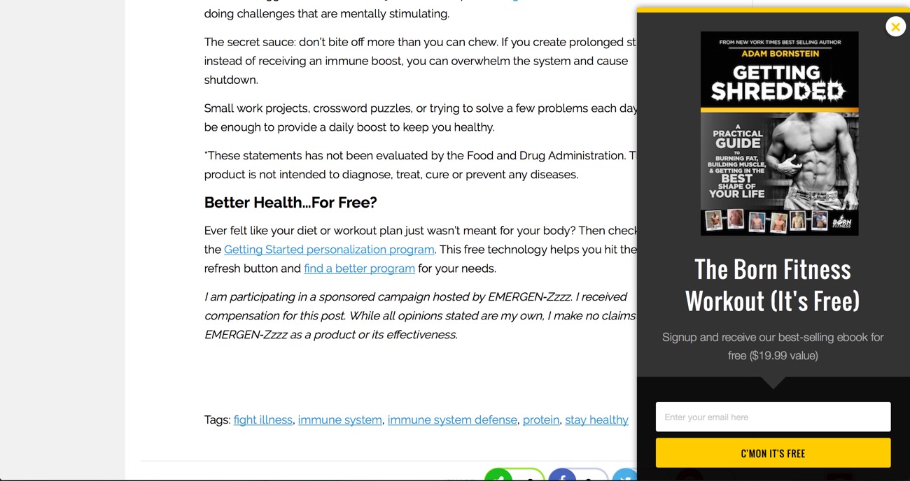
The Scroll Box
Currently, we are giving away our most popular selling eBook of all-time via a scroll box.

We consider this our lead magnet. For those not familiar, a lead magnet is “an irresistible bribe offering a specific chunk of value to a prospect in exchange for their contact information.”
The problem now is everyone is offering an eBook. For example, you go to Blog Tyrants homepage and what do you see?
So the real question isn’t what to do but how do you differentiate yourself from everyone?
I’ll break it down into 3 steps:
1. Don’t guess, know what your audience really wants
For this current example, we took an eBook that was generating a few hundred dollars a week and decided to give it to people for free. We’re not suggesting that everyone take this approach, but we were well aware that there was a high demand for the eBook.
So you may be asking what if I don’t already have an eBook? If that’s the case I highly recommend you read this article by Neil Patel. It highlights how to come up with a great lead magnet.
2. Test your copy
I can’t say this enough. Always test different ways of how you deliver the value of your product, service or ebook for this example. Even test the way the copy is arranged (list form vs. paragraph). For example we tested two variations below:
A. The Born Fitness Fat Loss Workout (Free 4-Week Plan)
B. Free 4-Week Workout Plan
We saw a 54% increase in conversions in version A compared to B with a 100% statistical significance.
3. Make sure your offer is mobile optimized
As mobile usage continues to rise and overtake desktop users it’s imperative that your site and opt-in be mobile friendly. For our scroll box, we specifically have two variations: mobile and desktop. The reason being our desktop opt-in has a much larger image than our mobile variation. When we created two different variations we saw a conversion increase of 43%.
(Note from Ramsay: here’s a post about how you can set these things up on your blog.)
Bonus Tip: You may not realize this, but your eBook may be getting found on Google for free by your website visitors. As a result, your conversion may be suffering due to a simple mistake.
Here’s what I mean. If you keep your eBook on a thank you page or upload it you may accidentally be having Google index the page without knowing. When Google indexes a page it will then show up in SERP’s. If your audience is savvy they can use a search feature such as “site:blogtyrant.com eBook”. (Note from Ramsay: I’ve since fixed this!)
If the page is indexed and the URL has the word eBook in it, they will be able to find it without ever giving you their email address. Yes, most people don’t suck, but it’s always better to protect yourself.
So how do you do this? Simple. If you have WP site download the Yoast SEO plugin. Activate the plugin.Then on any pages or posts you will find this module at the bottom. Under Meta Robots Index select “noindex”. Problem solved.
What one tip could you apply to your blog?
Big thanks to the guys over at Born Fitness and Born Fitness Consulting for agreeing to share some secrets with us today. I really appreciate it.
I’d really love to know what one single tip you could apply to your own blog. And please let me know if you like this concept of analyzing individual blogs and websites because I’ve got a lot more in my bookmarks ready to go.
Please leave a comment and let’s have a chat!
Top photo © Adrenalinapura


Definitely more of these, very handy to hear clued in people talk about their strategy. Golden advice.
Glad you enjoyed it!
Hi Ramsay,
This is amazing I absolutely love this website and I am subscribed to their list, I was hooked as soon as I saw it.
I always believe that following in the footsteps of those gone before you is a great way to crack the code of IM and this post is helping people do that.
Great Work Ramsay, Loved It!
Thanks
Joe
Thanks, Joe. That means a lot. I hope it helps.
Thanks for an excellent post.
I haven’t started IM or a blog as yet (building up to it) so informative posts such as this really do help a lot – especially tips like Yoast SEO “noindex”.
I for one really will look forward to more analysis of other blogs and sites.
Awesome! Thanks Barrie.
I like this concept! Learned a lot and would read more posts analyzing successful sites.
Thanks for letting me know.
I suppose its helpful, and here’s the but, but the reason it is so successful is because his passion for his site is in a highly sought after subject-health and fitness/weight loss. How does a normal person grow a niche site to where it can produce enough traffic to eek out any money. I think the great majority fall into this range and eventually die from frustration.
Hi Brian.
I think I’ll have to respectfully disagree. There are millions and millions of fitness sites. This makes it harder to succeed, not easier.
Of course, the passion he has and his excellent information is essential, as it is for every blogger or company owner.
I think the most important things to focus on in the beginning are being distinctive and finding some way to help beginners as much as possible. That’s the most important first step regardless of the niche.
Thanks for the great comment.
Hi Ramsay,
This was excellent case study from a great website. I don’t know as a blogger how good their business is doing but these conversions looks awesome to me as I am more of a techie guy.
Thanks for sharing this awesome case study and we can sure learn from this, specially the social testimonial thing, that I would like to test.
I’m so glad you enjoyed it.
I love the idea of a series like as well, so keep it up if you can! Also, what was the Neil Patel post that he mentioned? Thanks.
Oh whoops!
Great case study! Something to benchmark!
Exactly!
I love the idea of analyzing sites. Thank you. Perfect timing for me, as I am constructing a new site.
Thank you!
How are you finding the construction process?
Hi, Ramsay,
Thank you for asking!
The website construction turned into a disaster. Hired a designer from Fiverr, waited 10 days for my new site, got an email from Fiverr on day 10 saying they had canceled the order, shut down the seller’s account and refunded my money.
When I went to my site, it was horrible! My books were featured along with several others that weren’t even mine! (or even close to being in my niche) Truly, the whole site was a mess.
Ugh.
Starting over with a college student who is currently studying graphic design and needs some extra money.
Fiverr is great for a lot of things, but I wouldn’t recommend it for something as important as site design.
What do you think?
Jennifer
Horrible idea. What did you expect going to fiverr?
Yes, JuiCy, yes, I know. Thank you for the confirmation. 🙂
Jennifer
Great case study. I struggle with the concept of a welcome gate, because as a visitor I hate them. But if they’re proven to work, I guess I need to re-think using them on my site. Thanks!
I don’t think they mind that much. Do you have data that says that they hate it?
No data, just a personal preference 🙂
Really excellent Ramsay, and thank you Jordan for these wonderful tips!
I’ve also realised by reading your article that my free eBook is accessible through Google.
I’m going to fix the problem.
Many thanks.
Nice save!
I LOVE case studies and reverse engineering! The post was amazing, and I’d be very happy to see this concept again and again.
The testimonials and social proof tip… Quite obvious, but it somehow slipped from my focus. Planning on how to fix that now 🙂
Building our fitness product, these tips really help!
Thanks man. Always nice seeing you here.
Yo Ramsay. Thanks again for the solid piece!
You just reinforced that I need add the sites where I’ve guest posted or been “featured on.” They’re strong sites in space so it’s silly I haven’t done it!
I also plan to add some testimonials for people’s feedback on the two freebies I give away.
**ONE QUESTION THOUGH: Do they have to be full blown testimonials or can I just compile a bunch of the quotes people have given me and use their first name along with last name initial so I don’t have to go get their approval?
Last, I relay it every time but I’m really thankful you bring so much value in every post. I’d rather get one post a month from you with crazy value than one every week just to stay in front of me. Well done!
Hi David.
Thanks for the kind words.
I think it’s always a good idea to get permission before using anything anyone says publicly. Better to be safe than sorry. That being said, a one line quote is more than enough if placed in the right position. For example, a quote about how affordable X is would be best placed on your sales page.
Hope that helps.
I’m in the fitness niche so this was really helpful.
I’d be interested in knowing how gets traffic; social media, referrals, guest posts, media mentions?
If you do enough digging around you can find out using tools available on Google. 😉
Yes, please do more of these. They make clear and concise ideas actionable. I am now busy remaking my above the fold part of my home page.
Keep up the good work.
Hope it helps!
I LOVE this individual-blog-analysis concept. The best way to learn tricks of the trade is directly from the people who’ve mastered them. Please keep these coming!
Glad you liked it. Nice seeing you around here, Brooke.
Wow, there’s a lot of great information here. And all the strategies do make sense, once you think about it. Happy they decided to let us in on their tactics, almost everything could successfully applied on our websites, too.
Let me know how you go applying it!
That was a lot of helpful information! I would love for you to created more post similar to this one.
Thanks!
The idea with the “Welcome Gate” page is actually pure gold! Ever since integrating one of those on my niche blogs opt-ins have whent up by almost 304%!
Wow! Huge!
I’m very attracted to the idea of looking into individual blogs that have been successful. I think it would help people who have trouble taking concepts and actually applying them, to see a blog in their niche and how they do it.
What niche are you in, Gabe?
I’m in the Inspiration niche, but I’m working on narrowing that down a bit more so I can target a specified person.
Very slick website, but seems more of a giant digital product shop with a blog attached than a blog with optimized monetization techniques.. maybe there is a threshold blogs can cross over in pursuit of profit where they cease to be classified as “blogs” and instead become “businesses” that have attached blogs?
Regardless, very impressive site design.
Hi Erik. Interesting point. To be honest I wish more bloggers would do that. There’s nothing wrong with building a whole site or product around your blog to make it more beneficial for people and thus more successful. IMHO anyway.
I don’t believe there’s anything wrong either.. online publishing comes in many forms and we all gotta eat 😉
Ramsay,
Wow, absolutely love this post. I found it amazing that you actually reached out the the guys at Born Fitness to share with us their conversion optimization techniques.
At first, I though fitness blogs are not of my interest but man, I was wrong. Born Fitness totally blew me away with their inspiring website and convincing pitch. From their intuitive Get started page to the Welcome page (“Don’t google your fitness questions” is a genius catch, very relatable). It’s so good I ended up subscribing for the blog.
This is a lot of things to digest at the same time but what I found most valuable is the part about lead-magnets and choosing something that’s proven to work for your audience, like an eBook on high demands in this case.
I’d love to see more of this type of post, maybe you can even put it into a series. 🙂
Oh, I noticed some typos in the post:
“There’s no need to get fancy here. Just explain in simple terms why someone should give you their email” is repeated twice.
“I highly recommend you read this article by Neil Patel” has no link.
Okay, I’m off sharing this valuable piece!
Happy Friday,
Anh
Whoops! Thanks for the typo spotting!
Really love it. Thanks a lot Ramsay!
Thank you!
Hi, Ramsay,
I have never heard of Born Fitness but it is a wonderfully made site.
It was great to see a case study on what’s working in the fitness industry. As someone who blogs about blogging, I loved seeing that the same elements that make a blog successful transcends industries. Thank you for sharing this.
Thanks,
Sue
Thanks Sue. Hope all is going well for you!
Hello Ramsay,
That was great job you did there by getting those Born Fitness guys to elaborate more on their strategy as far as conversion is concern.
I have learnt my lessons and so have many other bloggers as well.
I’m glad you found it useful, Emmanuel.
Thanks Ramsay, really interesting and very useful for me as I’m currently researching/developing a lead magnet. Unfortunately there doesn’t seem to be a link to Neil Patel in the paragraph, “So you may be asking what if I don’t already have an eBook? If that’s the case I highly recommend you read this article by Neil Patel. It highlights how to come up with a great lead magnet.” Can you please let me know the link?
Fixed!
Thanks!
Too bad they have a typo in the Arnold quote. It’s on the getting started thank you page.
“to my advisors wh othey recommended”
Thanks Ramsey, this has really made me see the benefit of opt-in forms and how to use them effectively and in conjunction with each theme. Do you think opt-in forms work for everyone including more minimalist and abstract blogs . So if your design is everything and you don’t want pop-ups as it could be seen as too gimmicky, what other strategies could you use?
Thanks
[…] Insider Tips from One of the World’s Top Fitness Websites | Blog Tyrant […]
[…] Insider Tips from One of the World’s Top Fitness Websites | Blog Tyrant […]
For the first time i am here in this blog and its awesome. I love case studies and reverse engineering! The post was amazing, and I’d be very happy to see this concept again and again.
I’m so glad you enjoyed it.
Hi Ramsay,
Great tips and stuff which I could apply on my own blog. The “above the fold” really works based on my own experience. But in my case not opt-in but adsense. My clicks increased when I placed it on that location.
I guess I might as well start collecting email addresses.
Great article!
I had made a popup subscription page for my site, but I wasn’t sure why anyone should sign up after 5 sec without really seeing the blog. I’m trasforming it into Welcome pop up + benefits. I think this is a better idea.
Thanks (can’t wait the next article).
Hey ramsay, I hope your having a great day! This is my first time on the blog and I wish I would have found it sooner. Your very good at what you do and I have been reading lots of posts over the last few days.
I too have a blog, which I started some months ago and have found some real gems in your posts that I can add to my blog to become super blogger. haha.
Thanks for all the great information, a real blogger with quality information…I too pride myself on adding value and changing the way people look at earning an income online.
Your friend, Shaun!:)
Ramsay,
I’m going to be honest here. I’m 20 and I don’t have an instagram, twitter, or snapchat. I go to bed at 10:00 and I don’t like to drink. Needless to say I’m an old soul in a new tech savvy world. I am currently a fashion design student and have been managing (ish) a facebook page and a website (weebly). I would like to put those to rest and start a blog. I am one year from graduation and feel that is where my heart is. I have no idea where to start. What do you recommend?
Hi Jessika. First of all, there is no hurry. Take your time. When you’re ready you can follow along this guide. It links to lots of resources that can get you going: https://www.blogtyrant.com/start-a-new-blog/