
A re you looking for blog design examples?
Exploring top-notch blog designs can be a great way to inspire yourself to create a masterpiece on your own website. And that’s exactly what I will help you with below.
When you start a blog, it can be difficult to stand out from the crowd and convince people to read your content.
So, it’s essential to make a good first impression—and probably the best way to do that is with an eye-catching blog page design.
In this article, I’ll share 21 amazing blog design inspirations and examples to spark your creativity. Plus, a list of the 9 key design tips you can use to make your overall blog look great!
In This Guide:
Looking for a beginner-friendly website designer?
Canva is the best design tool for new site owners who are trying to create a beautiful blog. Choose from 100+ pre-built web templates, use a drag-and-drop editor, and publish directly to your domain. Try Canva’s One-Page Website Builder for free or purchase Canva Pro from $6.49 per month.
21 Best Blog Design Examples
Now that you know what makes a beautiful blog layout, let’s take a look at some real-life examples of blog templates that are performing incredibly well.
Hopefully, these blog designs will inspire you to beautify your own blog. Plus, we’ll share some design tips along the way that will help you recreate some of the features you’ll see.
Nearly all of these blogs are made with WordPress. Check out our list of the best blog site platforms to find out why WordPress.org is our #1 choice for creating a blog website.
Ready? Let’s finally get into our list of the best examples of beautiful blog designs:
1. Sincerely Jules

Sincerely Jules is a popular fashion and lifestyle blog with a gorgeous design. Her blog homepage begins by displaying a full-width header image of the latest blog post and a link to read the article.
There’s also a navigation menu in the top-left corner and links to her social media platforms are displayed vertically on the right-side.
As you scroll down the page, more of her latest blog posts are presented in a grid with large, eye-catching thumbnails.
At the bottom of the page, Jules has embedded her Instagram feed.
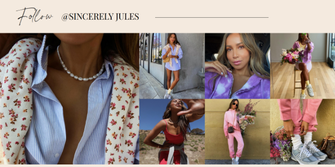
Doing this can help you:
- Keep your blog automatically updated with fresh blog content
- Boost engagement rates
- Get more social media followers
Want to display an Instagram feed like this on your blog? Check out our step-by-step tutorial on how to add an Instagram widget in WordPress.
Show me How!2. Cookie + Kate
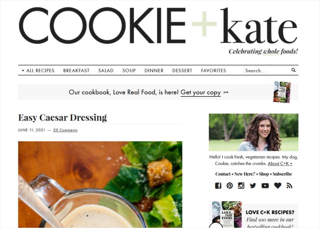
Cookie + Kate is a food blog with a modern and minimalistic design. The navigation bar at the top of the page lets visitors easily find the type of recipe they’re looking for.
As you scroll down the page, you can see all of the newest recipes that have been published.
The blog’s sidebar has a great design as well. It includes many widgets that help boost engagement and keep visitors on the site longer, including:
- A photo of the author and a link to the About page
- Social media icons
- An email newsletter opt-in form
- Links to buy her cookbook
- Popular blog posts
Want to customize your blog’s sidebar? Here’s a tutorial on how to edit your sidebar in WordPress.
Show me How!3. A Cup of Jo
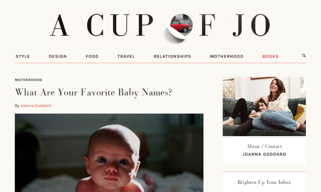
A Cup of Jo is another simple yet consistent design that puts all of the focus on the content, which covers topics like food, design, travel, motherhood, and more.
Like the previous blog examples, the navigation bar at the top of the page organizes the content into easy-to-find categories, and the latest posts are listed as you scroll down the page.
This blog design also includes:
- An email opt-in form
- Social media icons
- Popular blog posts
- Related posts
4. TED Blog

The TED Blog has a professional web design and layout that’s perfect for news blogs and websites.
The full-width header image at the top of the page promotes your featured article. Under the blog post title and description, there’s a call to action button to encourage visitors to read the post.
Underneath that section, visitors can scroll through all of the latest articles on the blog.
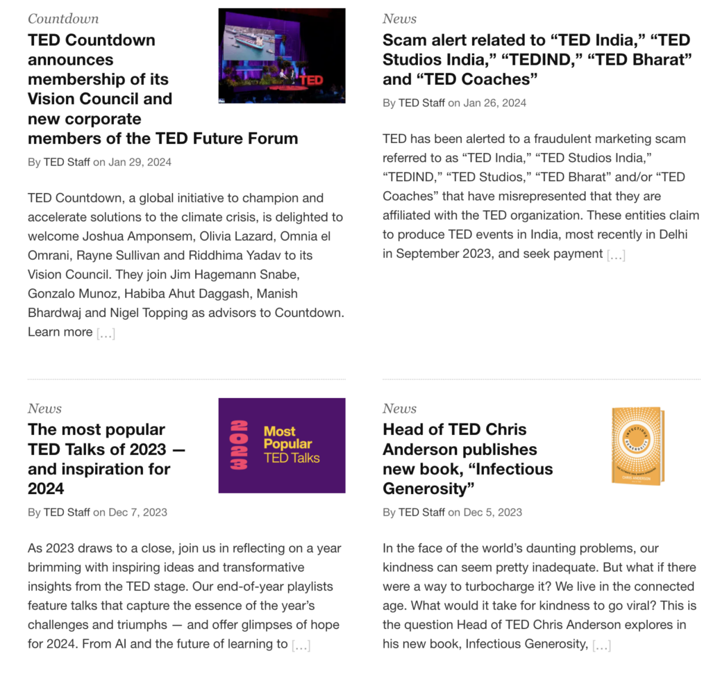
Visitors can also filter the articles that are displayed by newest, popular, or by other specific TED categories.
If you’re looking to create a business blog for a client, the TED Blog layout is the perfect option for you.
5. The Sartorialist
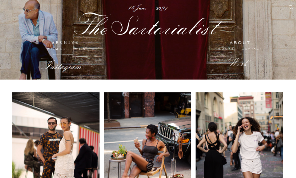
The Sartorialist is a well-known fashion and photography blog. As you can see, the blog design is focused mainly on showcasing the photographer’s beautiful work.
And instead of having to click a traditional “Next Page” button to see more photos, infinite scrolling is used to improve the user experience.
Visitors can also navigate the blog using the links in the website header. There are links to the:
- Photograph archives
- About page
- Contact page
- Instagram profile
- And more
Want to find a WordPress photography theme like this? Take a look at this list of the best WordPress themes for photographers.
Take me there!6. Dan Flying Solo
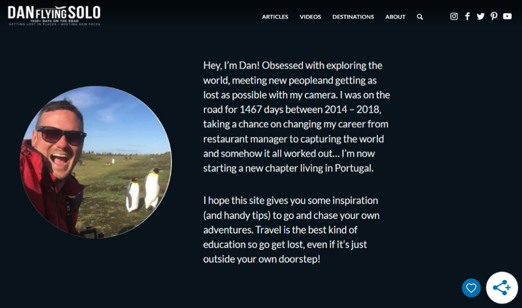
This travel blog design from Dan Flying Solo is simple, but it gets the job done.
The website header shows an About section where readers can learn more about who Dan is.
As you scroll down the page, you can see the latest posts from the blog.
Dan also embeds his travel videos from YouTube on the page. This is a great way to engage visitors and grow his YouTube channel.

Looking for a way to easily embed YouTube videos on your own blog? Here’s a step-by-step tutorial on how to embed a YouTube playlist in WordPress.
Show me how!7. Copyblogger
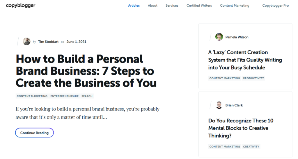
The Copyblogger blog has a minimal design that uses a lot of white space.
This blog design shows that you don’t have to cram a lot of elements onto the page to make it effective or visually appealing. Instead, you can let your amazing content speak for itself.
The page displays thumbnails of the latest blog articles. Visitors can simply click on the thumbnail to read the full post.
At the bottom of the page, Copyblogger offers a lead magnet to encourage visitors to sign up for their email marketing list:

Want to add a lead magnet like this to your blog? Check out our guide on how to create a lead magnet and get more email subscribers.
Show me how!8. Tiny Buddha
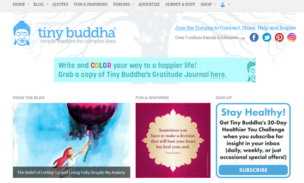
The Tiny Buddha blog design uses a soft color scheme to match its brand and create a calm feeling for its readers.
On the homepage, visitors can view the latest blog posts and navigate to the posts they most want to read using the category links.
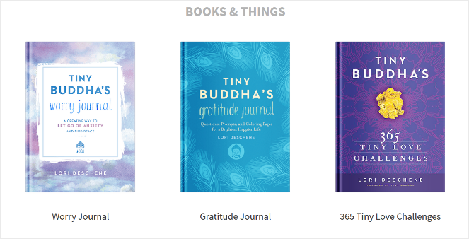
Tiny Buddha also uses the homepage to promote their members-only forum, books and journals, branded t-shirts, and more.
9. The Recipe Critic
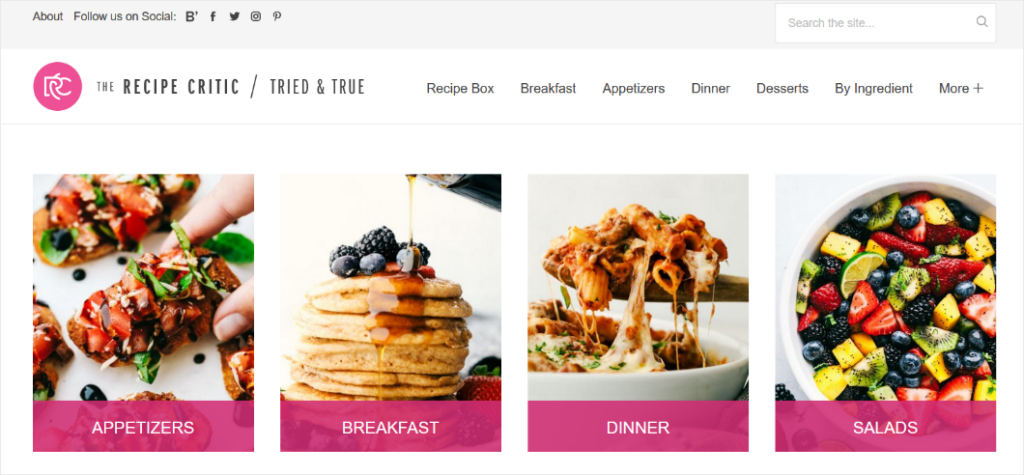
The Recipe Critic is another beautifully designed food blog. The homepage is organized into sections like appetizers, breakfast, dinner, salads, 30-minute meals, slow cooker meals, and more. Readers can easily find the exact recipe they need with this creative blog design.
The template also includes design elements like:
- A search bar
- Social media icons
- Author bio
- An email newsletter opt-in form
10. SPI

SPI, which stands for Smart Passive Income, has a super sleek and professional blog design.
They use the website header to promote their online courses. In the header image, they use photos of real people and testimonials to build social proof and encourage more course signups.
Further down the page, they display their latest blog posts. Visitors can filter which posts they want to read by category.
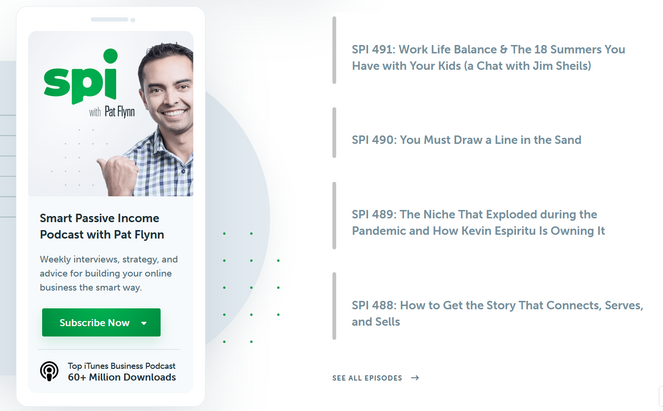
You can even listen to episodes of the SPI podcast right from the blog.
11. Writing Revolt
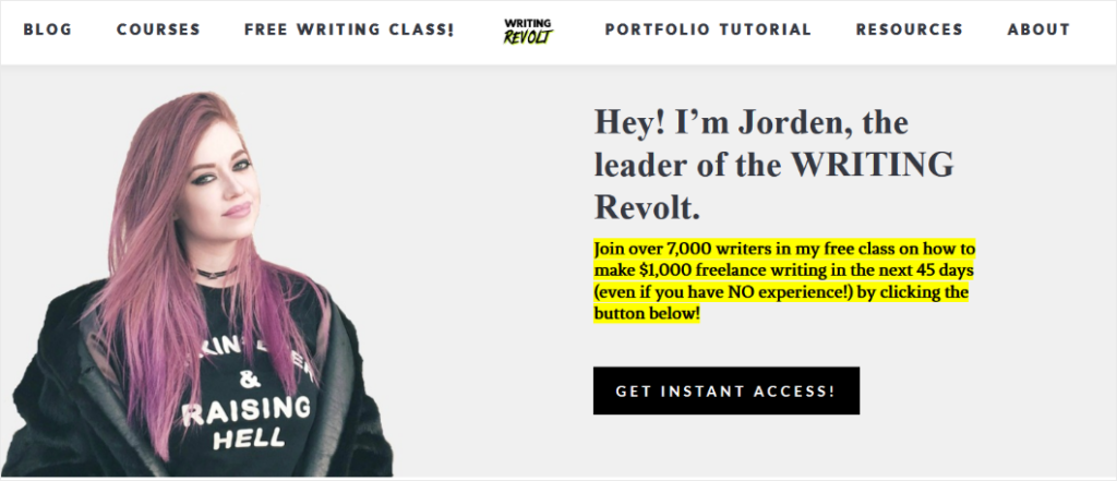
Writing Revolt is a blog that helps aspiring freelance writers create their portfolio, master SEO, and land clients.
At the top of the page is a photo of the blog owner, Jorden, introducing herself and her free freelance writing course. Visitors can provide their email address in exchange for access to the course, which helps Jorden grow her email list and sell paid courses later on.
There’s also a section of student testimonials:
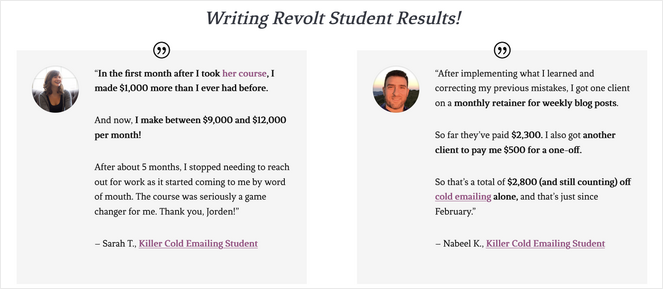
Displaying testimonials is a powerful way to convince people to sign up for your email list or buy the product or service that you’re offering.
12. He Spoke Style

This popular men’s fashion blog uses a classic layout where the website header displays a featured blog post, and underneath is a list of the newest articles on the site.
Visitors can also use the navigation bar to find articles about specific topics like grooming, watches, drinks, and more.
And take note of how the simple white background makes the images pop.
He Spoke Style also has an online store where visitors can buy custom menswear like suits, shirts, scarfs, and more.
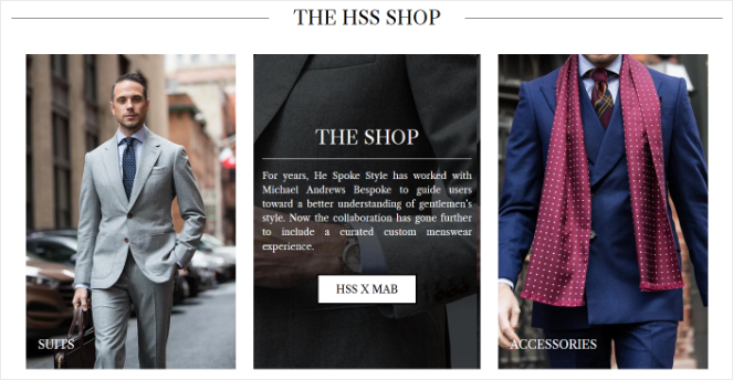
Want to add an online store to your blog? Check out our guide on how to start an online store for step-by-step instructions.
Show me how!13. TechCrunch

TechCrunch’s simple blog yet responsive design is perfect for readers that want to dive straight into the latest tech news.
There are featured blog posts displayed at the top of the page. Then, the newest posts are shown in a vertical list.
There’s also a navigation panel and search bar on the left-side to help visitors easily find what they need.
14. The New Yorker
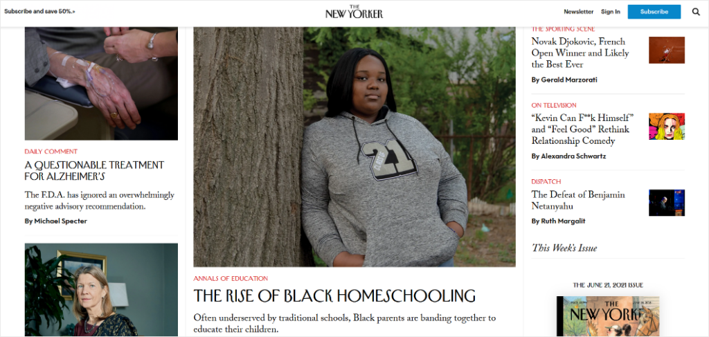
The New Yorker is another blog design example that works well for news websites. The page is packed full of their latest posts, separated into blog categories like spotlight, humor, fiction and poetry, videos, and more.
There’s also a section to display notable contributors and guest writers.
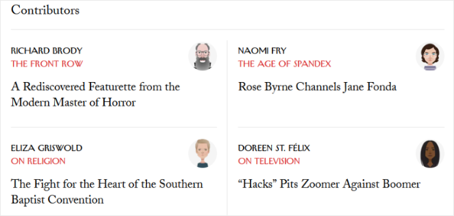
If you’re publishing tons of content on a regular basis or running a multi-author blog, this blog design makes perfect sense for your website.
15. Afford Anything
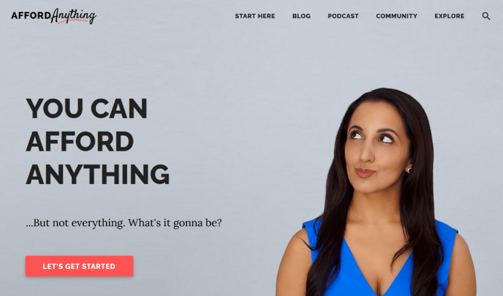
Afford Anything is a blog all about finance, psychology, and investing. It follows all of the blog design best practices, like adding social sharing buttons, displaying popular blog posts, and using eye-catching images.
Plus, at the top of the page, there’s a strong headline and a call-to-action button. When visitors click on the Let’s Get Started button, a popup appears offering a free ebook in exchange for their email address.
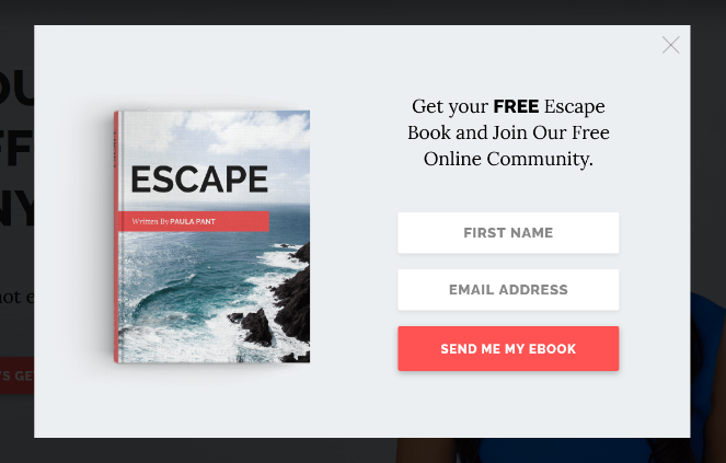
Want to create an opt-in campaign like this? Follow our tutorial on how to automatically send an ebook to your email subscribers.
Show me how!And check out our post on email popup examples for more inspiration.
16. A Forest Life
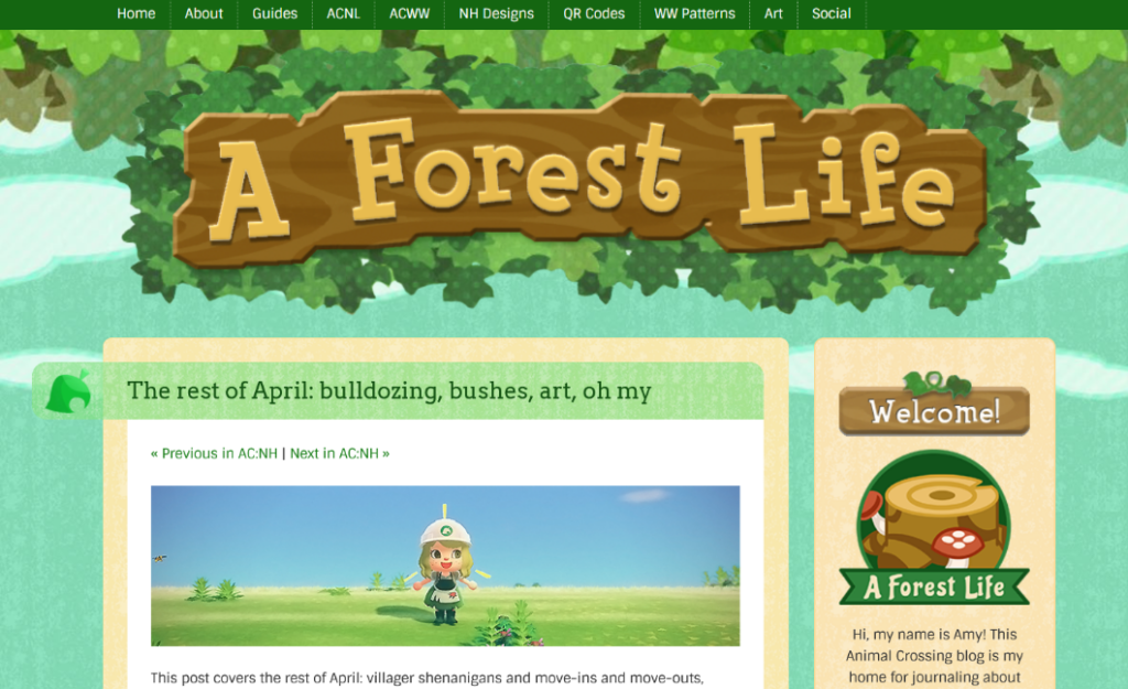
A Forest Life is a blog all about the massively popular video game series called Animal Crossing. And the fun and creative design perfectly matches the theme of the blog.
This blog design includes elements like:
- A navigation bar to direct visitors to different categories and resources
- Links to social media platforms like YouTube and Twitch
- A bulletin board with recent blog comments
17. Girlboss
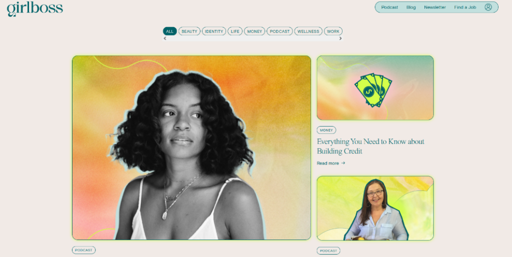
The well-known blog Girlboss is a great example of a colorful and modern blog design.
The blog layout is pretty simple. As you scroll down the page, you can see the latest articles, and you can filter them by category.
There’s also an email opt-in form, a job board, and episodes of the Girlboss podcast.
18. The QMan (The Quintessential Man)
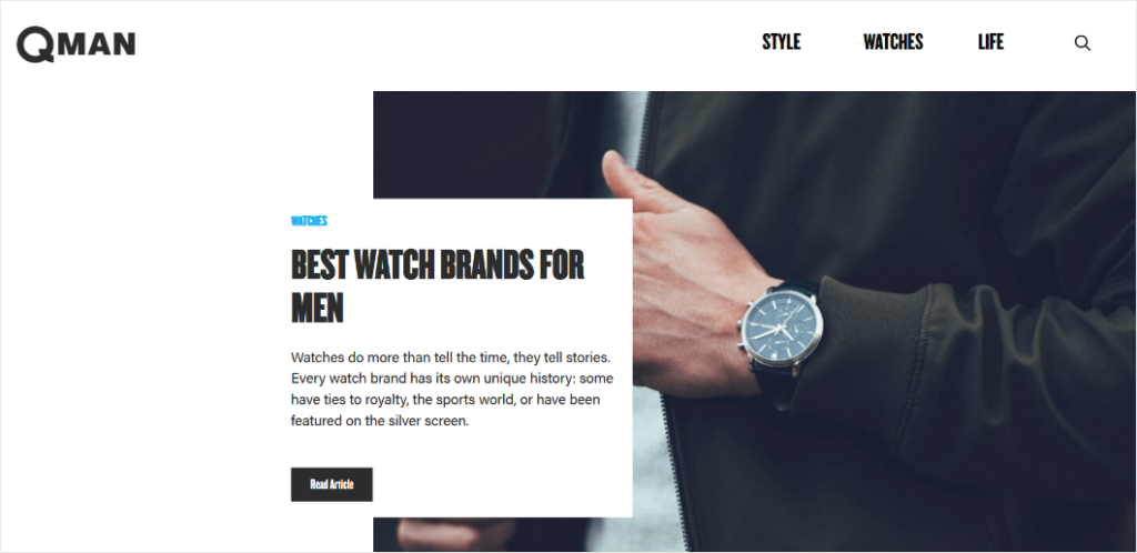
The QMan is a men’s lifestyle blog that has a simple, yet bold design. The eye-catching images and bold typography stand out against the clean and simple white background.
It has a similar layout to many of the blogs on this list; one article is featured prominently in the website header and as you scroll down, other recent blog posts are displayed.
The QMan also has a “Top Reads” section on the blog that features their most popular posts.
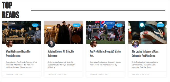
This is an effective way to get more eyes on your best-performing articles.
19. My Wife Quit Her Job
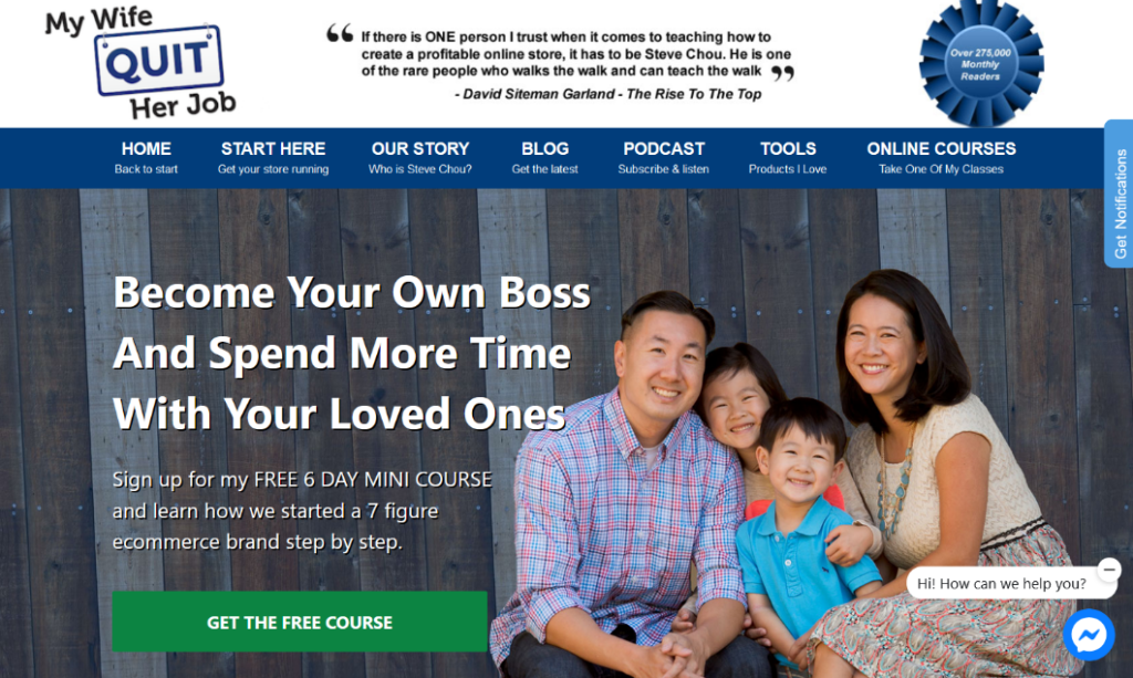
This blog is a prime example of having multiple elements on a page while still maintaining an organized layout that’s not too distracting for readers.
On the homepage alone, My Wife Quit Her Job promotes 4 different mini-courses, a podcast, their most popular blog posts, and affiliate products.
They even have Facebook Live Chat on their blog so that they can talk to their audience in real-time.
Want to add live chat to your blog? Here’s our list of the best live chat plugins for WordPress.
Take me there!20. Jess Ann Kirby
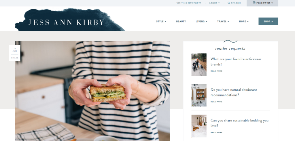
Jess Ann Kirby is the owner of this lifestyle, fashion, and travel blog with a clean and minimalist design.
But, what really stands out is how Jess promotes her affiliate products.
The “Reader Requests” section at the top of the page features questions her readers have asked her like: Do you have any natural deodorant recommendations?
Clicking on that question brings you to a post where she promotes relevant products with referral links.
She also showcases affiliate products in a carousel under a “Reader Favorites” section.
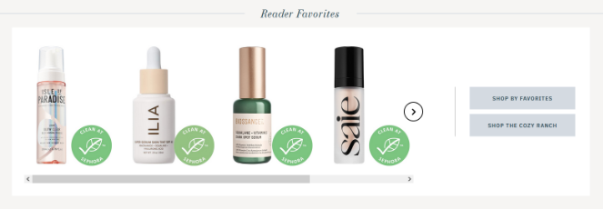
Both of these best design strategies will help to boost affiliate marketing revenue.
21. The Crafty Needle
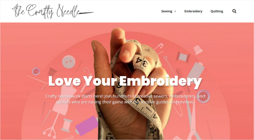
The Crafty Needle has a pretty straightforward blog layout. But, they use lots of color and eye-catching images to make it more fun.
The full-width website header image lets visitors know what the blog is all about.
And as you scroll down, blog posts are displayed under 3 different categories: Sewing, Embroidery, and Quilting.
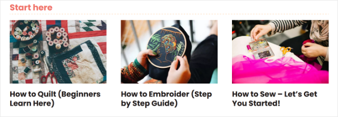
They also have a “Start Here” section where complete beginners can find the content that suits them best:
After seeing all these examples of beautiful blog designs, you might be wondering:
How can I improve my own blog’s design?
Well, we’ve got you covered.
In the next section, I’ll show you some of the crucial ways you can either start or revamp the design of your blog!
What Makes a Good Blog Design Layout?
Now that we’ve gone over the best blog design examples, let’s go over some basic principles of blog design that these sites do so well with.
You might think that an amazing blog design needs to include a bunch of flashy animations, elaborate typography or fonts, and all kinds of cool widgets.
But that’s not the case (although you probably do want to be using one the best fonts for bloggers).
If your blog design has too much going on, it can actually be a distraction for visitors, which defeats the most important element of a good blog design: Readability.
Visitors need to be able to easily read your content; otherwise, they won’t return.
So, here are some traits of a great blog layout and design that keeps readability in mind:
- White Space: White space isn’t necessarily white, but it’s an empty space between and around design elements on the page. Be sure to use white space in your blog design to draw your readers to specific areas, like your content, and make them easy on the eyes.
- Navigation: Your blog should have some sort of navigation menu so that visitors can easily find their way around and get to the pages or posts they’re interested in.
- Blog Header: The header section at the top of the page is often the first thing that visitors see when they arrive at your blog. It sets the tone for your blog and draws readers in. It should typically include a high-quality image, your logo, and a brief description of what your blog is about.
- Blog Cards: Displaying your blog posts in cards or thumbnails will let you show a lot of content to your visitors in an organized way. Blog thumbnails typically include a featured image, title, date, author name, blog excerpt, category, and a “Read More” button.
- Social Sharing: Incorporating social sharing into your blog makes it easy for readers to share your content across the web. An easy way to add social sharing buttons to your blog is with a plugin like Shared Counts.
These are just a few of the best practices to keep in mind before designing a blog, but it should be enough to get you started.
How to Create a Great Blog Design
If you want to create a beautiful blog design like the examples in this post, don’t worry—it’s not as hard as you might think it is.
Below are some of the keys to help you start a blog that will not only look good but stand the test of time!
1. Use a Brandable Domain Name
First things first:
A professional-looking blog starts with a professional, brandable domain name (don’t miss our full guide on how to choose a domain name for your blog).
Your domain name is super important. It isn’t just your address on the “World Wide Web”.
It helps you develop a brand that looks professional in the eyes of your readers and businesses that you may want to work with in the future.
Many new bloggers are tempted to sign up for a free blogging platform like Wix, WordPress.com, or Blogger to save money.
But the problem with free platforms is that you don’t get a professional domain name. You’ll be stuck with a domain name like www.Wix.com/MyBlog, instead of a branded domain name like www.MyBlog.com.
That’s why, at Blog Tyrant, we always recommend creating a self-hosted blog with your own domain name.
To come up with a great domain name, you can read our guide on how to choose the best domain name for your blog.
You can register your domain name for free when you create a self-hosted blog with Bluehost.
Get a Free Domain With Bluehost
Save big on your blog domain registration and get reliable web hosting with Bluehost! They offer 99.99% Uptime + a 30 Day Money Back Guarantee.
Get Your Free Domain Now!We’ll explain more about self-hosting in the next section…
2. Choose a Self-Hosted WordPress Blog
Creating a beautiful blog layout is much easier when you use a self-hosted WordPress.org blog.
Most free blogging platforms have very limited design and customization options.
But, with WordPress.org, you’ll get access to thousands of free themes and plugins to make WordPress look and perform better. This gives you complete freedom to add new design elements, features, and functionalities to your blog as it grows.
Plus, WordPress.org is completely free to use. You only need to pay for blog hosting and your domain name.
Be sure not to confuse WordPress.org with WordPress.com. WordPress.com is the free version with limited features. Read more in our comparison of WordPress.com vs WordPress.org for Blogging.
As I mentioned above, I recommend hosting your WordPress.org blog with Bluehost.

Bluehost is one of the best blog hosting services on the market and is officially recommended by WordPress.org. It’s affordable and reliable, comes with a 1-click WordPress installation, and offers expert 24/7 customer support.
Plus, Blog Tyrant readers get a special discount of 60% off with Bluehost, which comes with a free domain name, free SSL certificate, and more!
Exclusive offer for BlogTyrant readers
We have partnered up with Bluehost to get 60% off for our readers! You also get to register a FREE domain for a year which normally costs around $14.99 per year.
Claim this Exclusive Bluehost offerBut now that we’ve got the technical stuff like hosting and domain name out of the way – let’s dive into the actual DESIGN tips on making your WordPress blog look more attractive…
3. Create a Beautiful Blog Logo
Successful businesses usually have a logo to represent their brand.
So why not also have one for your blog?
A beautiful logo will help you make a strong first impression, stand out from the competition, and build brand loyalty. It’s also an important piece in marketing your blog because you can use it on your business cards, social media profiles, advertisements, products, and more.
You can also add your logo to your website, which is an easy way to improve the look of your blog.
Check out this gorgeous logo on Minimalist Baker, a popular food blog:
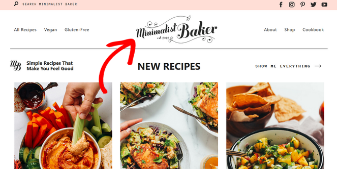
It’s prominently placed in the center of the blog and its classic yet rustic design fits perfectly with the blog’s niche of simple, homemade recipes.
Wondering how to create a logo without design experience?
You can easily create a beautiful blog logo with a free tool like Canva.
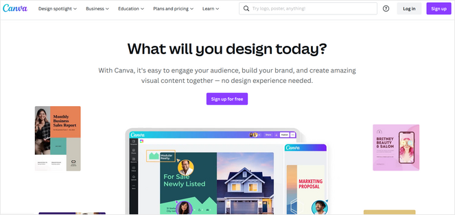
Canva is a popular browser-based design tool with many pre-made templates. The drag-and-drop builder allows you to easily add free graphics, shapes, text, and more to create your logo.
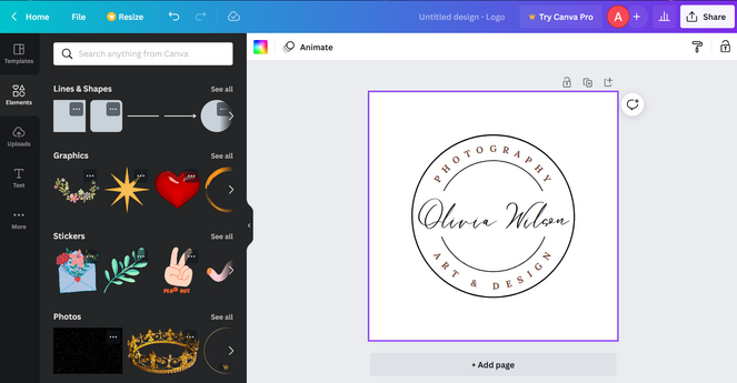
Want to compare Canva to other design tools? Check out our comparison of Canva vs. Adobe Creative Cloud Express.
4. Pick a Color Palette for Your Brand
A color palette is a set of carefully chosen colors that represent your brand personality. You will use it on your website, social media channels, and in all of your marketing materials.
Choosing a color palette makes it easy to create a cohesive blog design. Plus, by using color psychology, you can evoke particular emotions in your audience to make your blog design even more impactful.
For example, according to color psychology, blue is often associated with trust, loyalty, and reliability. Green is often associated with growth and freshness. And orange brings feelings of rejuvenation and positivity.
So, take a moment to think about what colors represent your brand and how they could affect the emotions of your readers.
To create a custom color palette for your blog, you can use a free tool like Coolors.
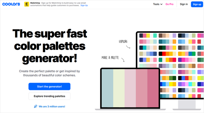
Coolors will automatically generate a color scheme for you. You can then lock in certain colors you like, and run the generator again to get a new palette. You repeat the process until you find the perfect color scheme for your blog.
5. Use a Clean and Lightweight Blog Theme
A WordPress theme is a group of files that provides all of the styling for the front end of your WordPress site, including the layouts, colors, font, and so on.
All you have to do is install the right theme, and you’ll add a beautiful look to your blog.
There are tons of free and premium WordPress blog themes to choose from. And, if you need help, we have a full guide on how to choose a WordPress theme for your blog.
You can use a page builder plugin to create a beautiful and custom website design.
But to quit beating around the bush – here are a few notable mentions to consider:
Astra
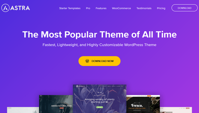
Astra is one of the most popular, free WordPress themes of all time, used by over 1.6 million websites. It’s fast, lightweight, and highly customizable.
Astra comes with a large, built-in library of pre-made website templates. There are templates for travel blogs, food blogs, business magazines, online health coaches, sports websites, and more. So, you can easily find a website design that fits your blog niche.
It’s also compatible with popular page builders, offers drag and drop editing with live previews, and you can easily control the design of your blog posts and archives with the customizer.
Divi
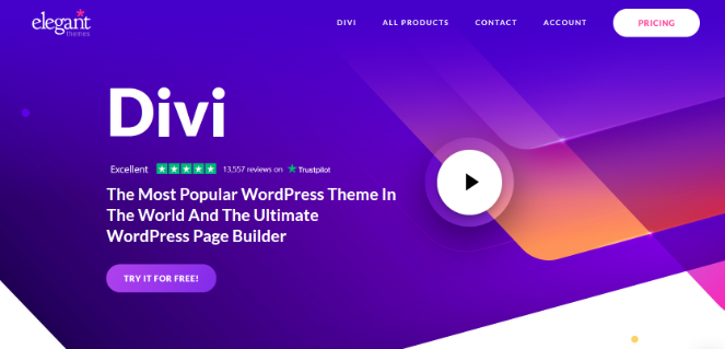
Divi is another solid option. It’s premium WordPress theme and WordPress page builder by Elegant Themes. It replaces the standard WordPress post editor with a powerful visual editor that makes it easy to create beautiful designs.
It comes with 200+ pre-made website layouts you can use to design your website quickly. New layouts and royalty-free photos, icons, and illustrations are added every week. There are also 40+ modules for blogs, sliders, testimonials, forms, galleries, and more.
There are tons of customization options so that you can control every part of your design. For example, you can create stunning hover effects, apply background images or videos, and add animations to any element.
SeedProd
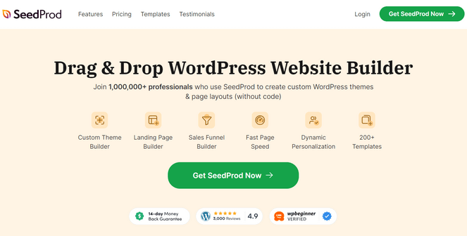
Ultimately, I recommend using SeedProd — as it’s objectively WordPress’s best drag-and-drop page builder.
It comes with a library of 120+ professionally designed website kits that you can install in 1-click. These website kits come with every page you need including the homepage, blog page, header, footer, about page, contact page, and more. Or, you can create your blog design from scratch using the drag and drop builder.
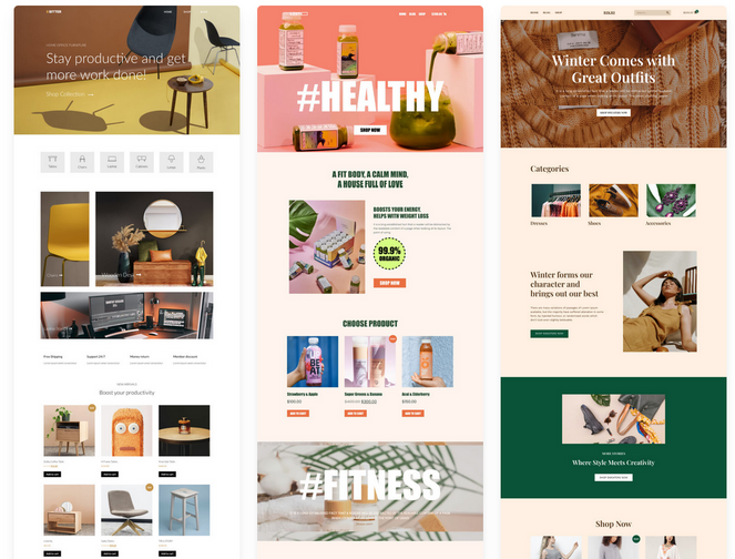
SeedProd also comes with 180+ responsive landing page templates and 90+ ready-made blocks to customize your site pages like:
- Animated headlines
- Pricing tables
- Contact form
- Email opt-in forms
- Countdown timers
- Social profiles
- Image carousel
- Testimonials
- Video background and slideshows
- Giveaway widgets
- And much more
All you have to do is drag the blocks you want and drop them onto your page.
Plus, SeedProd also offers built-in color schemes, unlimited font combinations, coming soon and maintenance modes, email marketing integrations, and more.
And it’s also fully responsive, SEO-friendly, and works with any WordPress theme.
But for more info, be sure to check out our detailed SeedProd review.
And for step-by-step instructions, check out our tutorial on how to create a custom WordPress theme for your blog.
6. Install the Best WordPress Plugins for Bloggers
Aside from themes, you can also use plugins to make WordPress look better.
WordPress plugins are software add-ons that allow you to add extra features to your WordPress site.
There are tons of free WordPress plugins that you can download from the official WordPress plugin repository, as well as premium plugins that can be purchased online.
Here are a few WordPress plugins that will help make your blog more beautiful:
WPForms
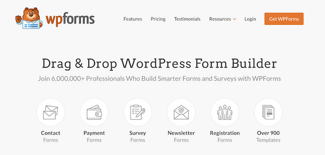
WPForms is the best drag and drop form builder for WordPress, used by over 6 million professionals. You can use it to create stunning forms for your blog including contact forms, newsletter signup forms, payment forms, surveys, polls, and more.
WPForms comes with a built-in library of form templates and features like smart conditional logic, instant notifications, easy form entry management, and spam protection.
There’s also a Conversational Forms add-on that allows you to create gorgeous, interactive form layouts that are guaranteed to boost form completion and improve conversions.

You can get started for free with WPForms Lite. For more advanced features, you can upgrade to the premium version starting at $39.60 per year.
Smash Balloon
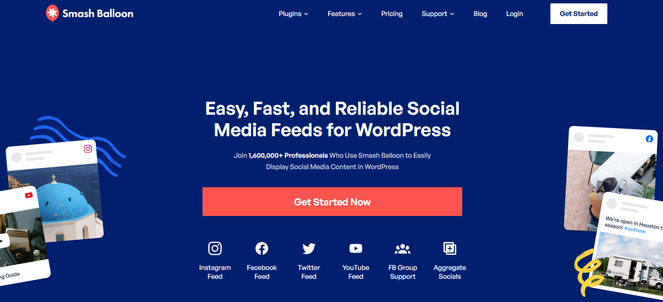
Smash Balloon offers a suite of plugins that allow you to display stunning social media feeds anywhere on your WordPress blog. You can embed feeds from Instagram, Facebook, YouTube, and Twitter, or create a ‘Social Wall’ that combines feeds from those platforms.
The feeds can be customized to look exactly the way you want. You can design the feed to match your brand, pick from multiple feed layouts, decide which posts to hide or display, choose to display likes and comments, and more.
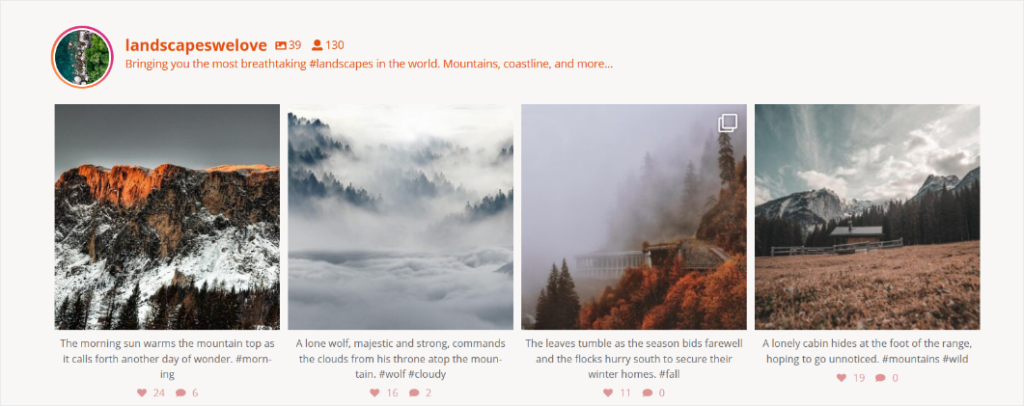
The feeds are also responsive and mobile-friendly so you can ensure they look great on any device.
There are free versions of the Smash Balloon plugins to get you started. Paid plans start at $49 per year and come with additional features.
To learn more, check out our detailed Smash Balloon review.
OptinMonster
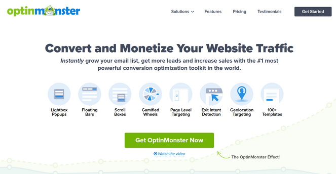
OptinMonster is the #1 lead generation tool that allows you to create eye-catching optin popups to build your email list.
With its powerful exit-intent technology, you can detect when a user is about to leave your site, and show them a gorgeous popup offer at exactly the right time to get them to convert.
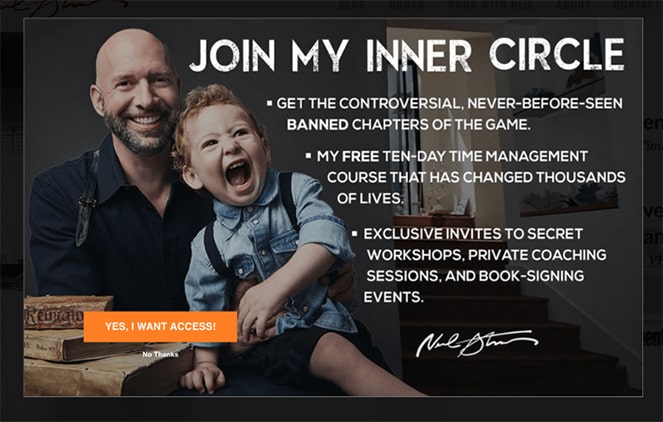
Aside from exit-intent popups, you can also create floating bars, scroll boxes, gamified wheels, countdown timers, full screen welcome mats, and more.
OptinMonster comes with an easy drag and drop builder, tons of professionally designed templates, campaign scheduling, A/B testing, conversion analytics, and much more.
Check out our OptinMonster review to learn more.
You can find more plugin recommendations in our list of the best WordPress plugins for blogs.
7. Add High-Quality Images
A text-only blog is not very visually appealing, that’s why it’s important to add high-quality images throughout your website.
Take a look at The Blonde Abroad, which is solo female travel blog. It’s filled with stunning photos that the blog owner, Kiki, has taken during her trips around the world.
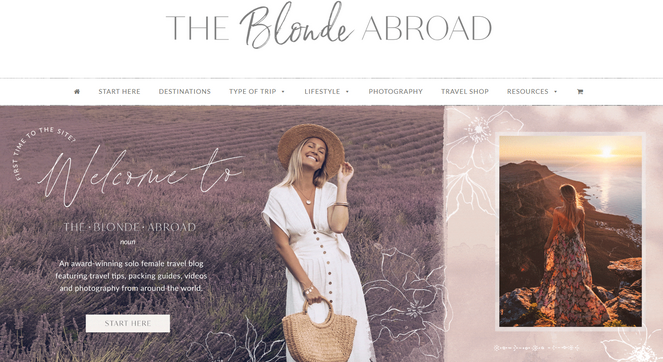
If you’re not an experienced photographer, capturing images like this can be difficult.
Luckily, there are tons of sites that offer free, high-quality stock photos to help you decorate your WordPress blog, like:
You can read our guide on how to find free images for your blog to get more stock photo site recommendations, learn how to choose the best photos for your brand and find tips on resizing, editing, and optimizing your blog images.
Want to create a photo gallery on your blog? Read this tutorial on how to make a photo gallery in WordPress.
8. Stick with a Consistent Blog Post Layout
Other than the overall design of your website, you need to consider how your blog posts look as well.
Visitors will spend the majority of their time on your site reading your content. So, it’s important that your blog post layout is consistent and looks great.
You might be wondering, how do I style a WordPress blog post?
Simply follow these steps to create an appealing blog post layout:
- Introduction – Each blog post should start with an introduction that explains what your post is about. Keep it short and compelling to encourage people to keep reading.
- Body – The body, or the middle section of your post, should go in-depth about the topic of the article. You can break this section down into steps or create a list to make it easy to follow.
- Conclusion – The conclusion at the end of your blog post should include a summary of the topic and a call to action to let readers know what to do next. You can tell readers to follow you on social media, subscribe to your email list, or read related posts.
- Table of Contents – Adding a clickable table of contents to the beginning of your posts will allow readers to see what your article contains and help them jump to the section they’re most interested in.
- Headings – You should add headings and subheadings throughout your post to guide readers through your article. Use H2 headings for your main points and H3 or H4 headings for your subpoints.
- Images – Add a few images throughout your article, especially in longer posts, to illustrate your points and make it more visually appealing for your readers.
- White Space – Use short paragraphs to create white space, or negative space. This makes your blog appear more clean and uncluttered.
You can see our guide on how to structure the perfect blog post and how to write a good blog post for more detailed tips.
9. Remember: Less is More
As you’re designing your blog, you might be tempted to add every beautiful detail you can think of. But, remember, less is more.
A blog that’s cluttered with too many images, illustrations, animations, and other features will only distract your readers from what’s most important: your content.
If your blog has any visual clutter, remove a few elements to create a more enjoyable experience for your website visitors.
Key Takeaways For Blog Design Tips
- Design for Readability: Use clear layouts with ample white space and prioritize a user-friendly navigation menu.
- Compelling First Impression: Craft a blog header that includes your logo, a captivating hero image, and a brief blog description.
- Showcase Your Content: Utilize blog cards featuring post titles, enticing excerpts, and eye-catching thumbnails.
- Boost Engagement: Integrate social sharing buttons to encourage readers to spread your content.
And for those who want to go beyond the basics:
- Strategic Promotions: Feature courses or products prominently in the header to maximize sales.
- Build Trust: Showcase testimonials from satisfied customers or readers.
- Visual Appeal: Employ a clean white background to make your images truly pop.
- Organized Content: Categorize blog posts for your audience to navigate quickly and easily.
- Compelling Calls to Action: Craft strong headlines that include clear calls to action, prompting desired reader behavior.
Closing Out On These Blog Design Examples and Tips
That’s a wrap!
We hope you enjoyed this list of amazing blog design examples. Now that you’re full of ideas and have some tools to help you out, designing a successful blog layout should be a breeze!
If you like this post and want some more inspiration, check out our list of the best contact pages on the web.
And don’t forget to sign up for our email newsletter for more helpful blogging tips!

thank you very much for sharing this blog
nice blog and your website is really cool
Thanks Rohan!
Hey
You are right it is very difficult to stand out from the crowd and convince people to read your content.
We can attract readers from our different blog design so we have to design some different .
Your all suggestions are very good and I also gain some new ideas.
Thank you
Sweety
Thanks for your article of 21 wonderful blog page,
What is the different of blog or post page.
what is the different of website or blog page.
Hi there, thanks for commenting! To answer your questions, you can check out these 2 articles:
What is the Difference Between Posts vs. Pages in WordPress
What is a Blog and How is it Different from a Website? (Explained)
Hope that helps!
Nice examples for blog designs!! They were really helpful to me for planning my new blog design.
Thank you.
Thank for this article. There are beautiful themes.
your article is valuable for me and for others. Thanks for sharing your information!
Keep posting more blogs and articles like this
In short, I can’t recommend this post enough. It’s a must-view for anyone interested in topic above. Good work to the author, you have truly outdone yourself! Keep the good blog coming.