
L ooking to get inspired with some great email popup examples? You're in the right place!
Email is one of the best ways to keep in touch with your target visitors, so adding a high-converting email popup to your site can be a game changer when growing your blog.
In this article, I’ll share some more real-life email popup examples that have been proven to convert (with the numbers!) and show you how to make an email popup in minutes!
In This Guide:
- Types of Email Pop Ups
- Simple Email Pop Up + Lead Magnet
- Coupon Pop Up Offer
- Email Pop Up Example With a Challenge
- Invitation Pop Up Example
- Simple Email Pop Up With a Photo
- Using Video Pop Ups to Grow Your Email List
- Yes / No Email Opt-in
- Exit Intent Pop Up Example
- Yes / No Pop Up With Clear Consequences
- How To Create an Email Popup In Minutes With OptinMonster
- Key Takeaways on Email Popup Best Practices Website Visitors Love
Ready? Let’s take a look…
Types of Email Popups For Your Email Capture and Newsletter
Email popups, also called opt-ins, are the best way to grab your visitors’ attention and quickly collect emails for your newsletter – and the proof is in the numbers:
- Travel blogger Thibaut Pakiry doubled his email sign-ups using email popups.
- Alex Chris, Digital Marketing Manager at Reliablesoft.net, used his email signup popup to increase conversions by 300% with popups.
- Photography blogger and course creator Cole Joseph used blog popups to increase course sales by $55,494!
There are many different types of popup tools available to bloggers.
But if you use a dedicated lead generation software like OptinMonster (like those examples above) you’ll have much more flexibility regarding templates and functionality.
You can choose from email pop-up types such as
- 400+ templates
- Drag and drop builder
- Dozens of campaign types
- Powerful targeting rules
- Onsite retargeting
- Email intefrations
- A/B testing
- Built-in analytics
- Mobile popups
- All types of popup types
- And much much more
You’ll also have access to full-screen welcome mats, slide-in scroll boxes, floating bars, mobile popups, countdown timers, coupon wheel opt-ins, and much more.
Plus, be able to do things like geo-location targeting, A/B testing, advanced segmentation, referrer detection, and page-level retargeting to create highly personalized popup offers that your website visitors will love.
On the other hand, if you’re creating popups with email marketing service providers like Constant Contact or Brevo (formerly Sendinblue), you’ll have access to more basic options.
Here’s what we’ll dive into in more detail below.
- Email capture form: You’ve already demonstrated the value you’re giving people through your blog posts and other site content, and people are happy to enter their email address.
- Exit intent: This form pops up when someone is about to leave your site. An exit intent popup gives you one last chance to deliver a value proposition to them so they will hand over their email address. For example, you could ask for their feedback or offer a discount code.
- Two-step opt-in: These are also called Yes / No opt-ins because they give the user a choice of whether or not to opt in. This psychological trick has been proven to boost conversions.
- Lead magnet: This classic type of form is used by both newbies and professional bloggers alike. They offer a downloadable piece of content in exchange for a visitor’s email address. You can offer a short eBook, checklist, infographic, or even a sample of your product and send it to their email address automatically. You may have to try a few different options to see what content works best with your audience.
- Discount or coupon codes: Perfect for e-commerce sites, those selling products and those who want to offer a coupon code to visitors in exchange for their email address. This is a great way to convert people who are thinking about buying from you but need a final push to do it.
- Contest or giveaway: Try running a give away contest where you give away one of your products or an exclusive content piece.
Let’s get into it.
Best Email Popup Examples
When it comes to converting visitors into leads, email popup design is everything.
So, I’ve gathered a few of the best email popups around to inspire you.
1. Simple Email Popup + Lead Magnet
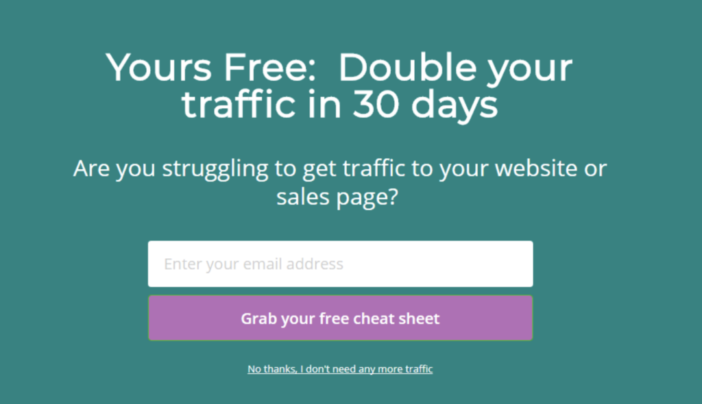
In this email subscription popup for blogger and entrepreneur Lilach Bullock uses a popup in a welcome mat format (as in first popup) when visitors arrive on her site. It’s a simple and clear email popup form that uses her brand’s contrasting colors and style.
She also offers visitors a lead magnet in exchange for their email in her email subscription popup, which makes people more likely to subscribe. She clearly explains the value the toolkit will deliver, further enticing visitors to subscribe.
This popup has a conversion rate of 5.09%, meaning that 5.09% of her site visitors subscribed to her email list right away. She uses a slightly different website popup when visitors leave her site, still offering the cheatsheet, and converts 8.09% of people with it.
2. Coupon Popup Offer
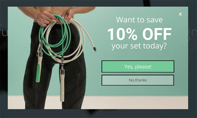
If your blog sells products or uses affiliate links to make you money, coupon email popups work great. For your campaigns, you can offer people a discount or coupon code in exchange for their email address.
You add them to your list, and they get a discount on something they were thinking of buying.
Here, Crossrope‘s nicely branded discount popup (also known as an exit-intent popup) appears just as people start navigating away from the site.
The minimalist design with simple CTA (call-to-action) asks the question: “Want to save 10% off your set today?” with the option to receive the discount or not. This particular popup appears everywhere on their site (except their blog) and converts 7.65% of people.
People love getting discounts, so this type of offer is great for increasing email subscribers!
Want to create a coupon pop up that converts like crazy? Follow this step-by-step tutorial to get started now.
Get Started NowAlso, a coupon email popup works perfectly to reduce cart abandonment if you run an eCommerce business via Shopify or another platform.
If you’re having trouble getting shoppers to make their first purchase, offering a discount or free shipping is an awesome way to encourage them to proceed to the checkout.
You can even add a countdown timer to your coupon popup to increase urgency. And a study by Drip showed that popups with timers convert more than those without one by 8%!
New visitors will rush to sign up and help build your email list and buy what’s in their carts before the discount expires.
3. Email Popup Example With a Challenge
To see if they could have success with another type of popup, Crossrope added this eye-catching email capture popup to their blog in addition to the one above:

Again, it’s an exit intent popup that displays after people read the blog and start to navigate away from it. It’s a full-screen popup (instead of the popup window they use elsewhere) and invites people to participate in a product challenge.
What’s smart about this popup is that the content is relevant to the site and blog (getting fit) but doesn’t sell them anything. It simply asks if they want to sign up for a challenge. This is an enticing question for those thinking of getting healthier and working out. And it’s working for Crossrope, as it converts 13.71% of all visitors.
Between these two email popup examples, Crossrope adds 1,800 people to its list every month. That’s an additional 1,800 people who are potentially interested in their products and will enjoy hearing from them in their email newsletter.
If you want to learn how to build your own newsletter, don’t miss our beginner-friendly guide on how to create an email newsletter.
4. Invitation Popup Example
People join an email list to be “on the inside.” They want to be the first to know all the deals, advice, and other information bloggers send to their community.
Neil Strauss, an award-winning journalist and bestselling author, uses invitational email popup best practices to attract people to his community, which he calls The Society.
The previous version of his popup was pretty dry and bland. Sure, it explained what people would get if they joined The Society, but it wasn’t hitting the mark for his audience. It only converted 4% of his visitors.
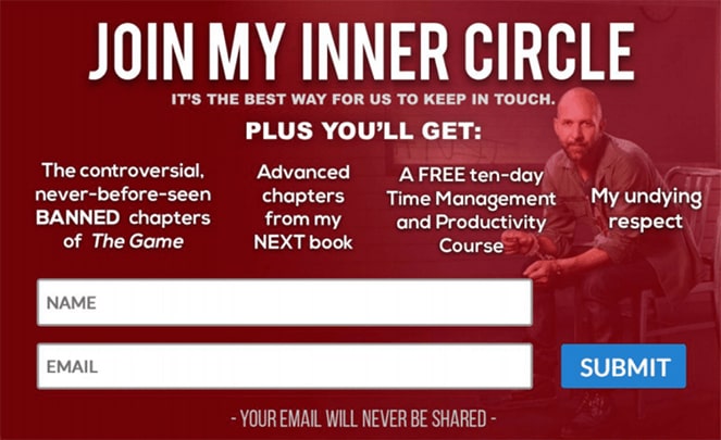
But when he changed the format and copy to focus on the benefits of The Society and made the pop-up design more personable with a fun picture of him and his son, he noticed a dramatic improvement.
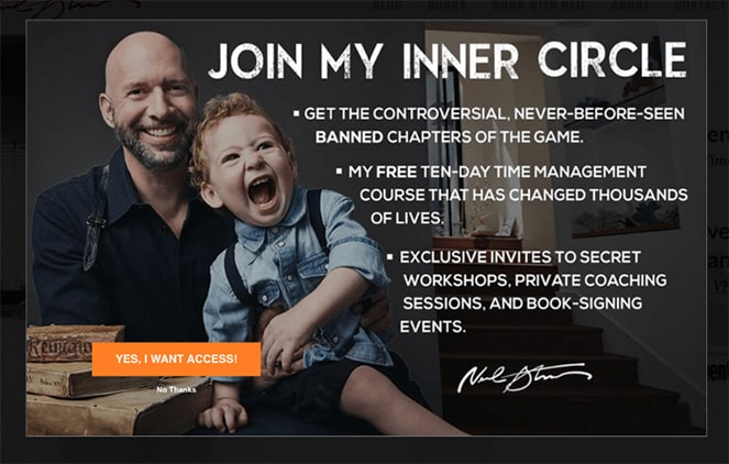
Neil increased his email conversions by 125% and grew his list by 8%!
Neil is proof that you can turn ineffective popups into the best email popups with just a few small tweaks!
5. Simple Email Popup With a Photo
Writer, author, and entrepreneur Ryan Robinson also noticed a dramatic improvement in his email list growth when he started with a basic popup form on his website.
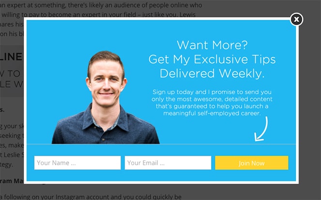
Ryan enjoyed a 6% increase in conversions with this email popup. The copy explains the value of subscribing to his email list and is simple for people to use. It’s uncluttered and branded to the rest of his site.
He uses a content giveaway to convert even more site visitors and readers, to the tune of 100 new subscribers to his list every month.
6. Using Video Popups to Grow Your Email List
A new way to capture emails in a popup is by using video in your popup window. This is a creative email popup that helps you target your highly engaged readers who may be more likely to take action after watching the video.
Scott Wyden Kivowitz is a photographer, educator, blogger, and author who uses a targeted video-based pop-up to capture email addresses for his list.
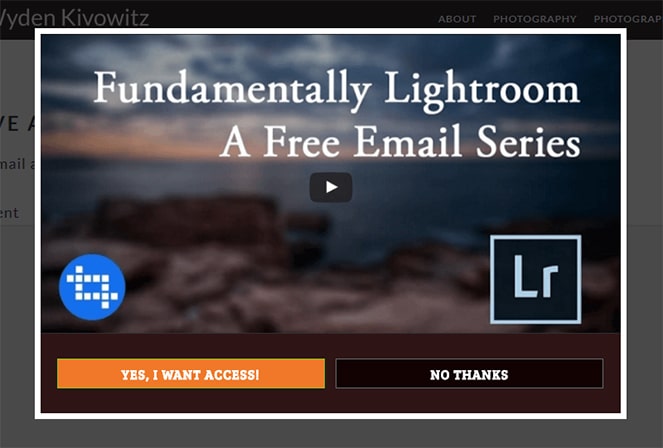
Scott converts 3.3% of his site visitors, adding dozens of new people to his monthly email list and growing it by 328% overall. He offers this course for free to visitors and then uses his email list to convert them towards his more in-depth, paid course.
7. Yes / No Email Opt-in
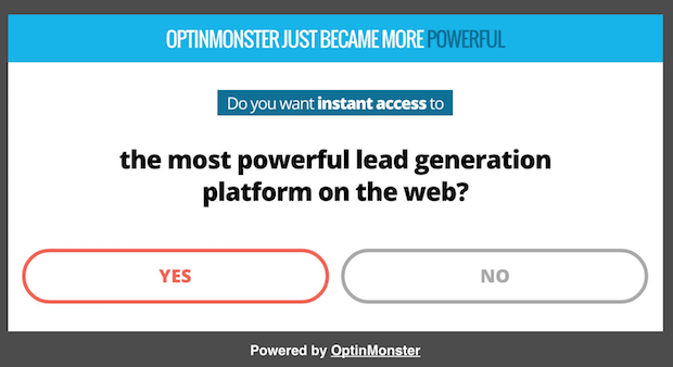
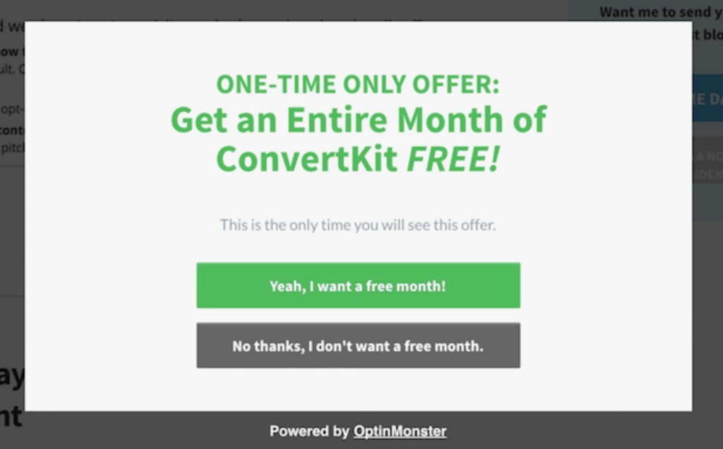
One of the best popup examples is a Yes/No pop up. A Yes/No newsletter popup can be a powerful way to increase your email list using a simple psychological effect: When people start a process, they’re more likely to finish it (mainly because they want to achieve closure, which gives them a certain sense of satisfaction).
Because visitors have already started the opt-in process by clicking Yes or No in the website popup message, they’re more likely to enter their name and email address at the next stage.
8. Exit Intent Popup Example
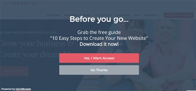
This minimalist website popup message asks a simple question for a site visitor. It’s branded for the site and uses popup copy that invites a click.
Exit-Intent® triggers a popup to appear right when a visitor is about to leave your site, giving you one last chance to grab their attention before they leave for good.
This kind of popup uses our inherent fear of loss well because most users don’t want to miss out on this special offer, so they subscribe before leaving.
9. Yes / No Popup With Clear Consequences
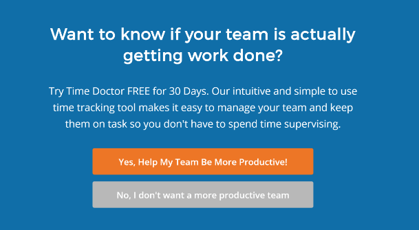
Here’s another one that’s simple, clear, and offers more value to visitors.
This is a great example of a Yes/No popup because it makes the benefits and consequences of each click very clear.
Click yes, and you’ll help your team be more productive!
Click no, and it means you’re missing out.
Using this type of call to action to create an email popup visitors can’t ignore can be very powerful!
And if you’re still not convinced, here’s another example!
How To Create an Email Popup In Minutes With OptinMonster
To create an email popup on your WordPress blog using OptinMonster, you can follow these steps:
- Create a Visually Stunning Offer:
- Start by selecting one of the pre-built templates from OptinMonster that are specifically designed for maximum conversions. Alternatively, you can also start from scratch with a blank canvas if you prefer.
- Customize the design using OptinMonster’s drag-and-drop builder, which doesn’t require any coding knowledge.
- Target and Personalize Your Offers:
- Use OptinMonster’s powerful targeting and segmentation engine to display your popup to the right audience at the right time. This will help significantly increase your website’s conversion rates.
- Page-Level Targeting: For this, you can take advantage of their page-level targeting, which allows for advanced segmentation and targeting and again ensures that the right messages are shown to the right visitors.
- Test and Adjust in Real Time:
- Use OptinMonster’s analytics tools to track the performance of your popup. You can conduct A/B testing by trying different headlines, content, and layouts to see what works best for your audience.
It’s really that easy…
Key Takeaways on Email Popup Best Practices Website Visitors Love
- Email popups are proven to increase conversions, with examples like Thibaut Pakiry doubling sign-ups.
- Offering lead magnets like toolkits or cheatsheets alongside popups boosts subscription rates.
- Coupon popups are effective for e-commerce sites, offering discounts in exchange for emails.
- Challenges or invitations in popups can engage visitors, like Crossrope’s product challenge popup.
- Clear and visually appealing popups, like Neil Strauss’s, can significantly increase conversion rates.
- Simple popups with clear value propositions, like Ryan Robinson’s, can yield substantial list growth.
- Video popups can capture highly engaged readers and lead to significant list growth, as seen with Scott Wyden Kivowitz.
- Yes/No popups leverage psychological effects to boost conversions effectively.
- Exit intent popups and popups with clear consequences can effectively grab visitors’ attention and drive actions.
Boost Subscribers with Best Practices From These Email Popups
We hope you enjoyed our list of the best popup examples!
Now that you’ve seen some of the best email popups, it’s time to start thinking about adding an email popup to your blog to grow your email list.
Use these popup examples to inspire your marketing strategy, look at the templates your provider offers, and be creative! By creating effective email pop-ups, you’ll soon be able to turn a large number of website visitors into new subscribers.

Very Good Article.
Thanks for the detailed information sir. People need to get aware of what popups are and how they help in promoting a Blog. It will bring subscriptions from real visitors and you can connect directly to them. This helped me a lot. Keep posting.
Regards.
Nice Explanation About All popups Thank you For sharing, Please keep Sharing
Thank you,
AFFINIQ
Nice Explanation About All popups Thank you For sharing, Please keep Sharing!
It’s really very informative and helpful. Thank you for sharing such an amazing information. Besides this every thing is clear and best in this article. Keep it up.
I love this article its amazing and great thoughts for blogging
This article has so much amazing information. Today I learned so many things in this blog post. Keep doing your awesome work.
good job